
Digital design, UI & UX for Itsu, a chain of asian-inspired food in the UK. Itsu is an Asian influenced sushi and noodle chain of restaurants with over 60 stores across the UK.
I was brought in as an external consultant to design the user journey & UI/UX of their planned self-checkout kiosk. This would be a completely new way an Itsu store would function and was successfully trialed at Bedford Row before an updated version was rolled out into 3 other stores across London.

Overview
- Project type: Team project
Collaborating with a project manager, executive board, operational team, tech team and an external development company, alongside the Marketing team - Duration: November 2018 – Sept/Nov 2019
- Role: Designer, UI/UX,
- Tools: Photoshop & Figma
- Result: Self-service checkout kiosk launched and installed in a few shops across London
Bedford Row (Holborn), Stratford, Spitalfields Market, City Road, Lime Street (Bank) & Great Portland Street
The Problem
• Create a self-service checkout while maintaining Itsu’s core brand promise to serve customers in 90secs rule.
• How do we make it quick and simple for users unfamiliar with self-checkouts
• How do we make the 2 user journeys for ordering hot food from a menu or picking up pre-made cold sushi from a fridge combined into a single process?
Business Goals
• Reduce the number of staff working on tills so the focus can be in the kitchen.
• Improve or increase hot orders by making it easier for customers to order
• Make it easier to offer customisation for hot food
Design/User Goals
• New customers should find the process as intuitive as possible
• Checkout process should be smooth and easy with as few steps as possible
• Improve how a customer can see what is on offer on the hot menu
• Blend the 2 different types of user journeys for hot and cold food: Order from the hot menu, pick up and pay from the cold menu
Average User
Itsu’s market are largely working professionals looking for quick healthy work lunches, the majority who are aged 25-40.
With smaller groups of 35-50 both in the suburbs and in the city. Most will be tech savvy but a small minority will not be.
Speed, health and fresh food is the itsu customers key requirements.
Environment
Busy business central districts where there is a high turnaround of customers at lunch time.
The app will be used on a vertical touch-screen display screen with resolution 1080x1920px.
Screen will be positioned at eye level horizon with a card machine and paper bagging area attached above or below
There is no barrier between the screen and the customer and a 1ft + gap between screens
Competitor Analysis
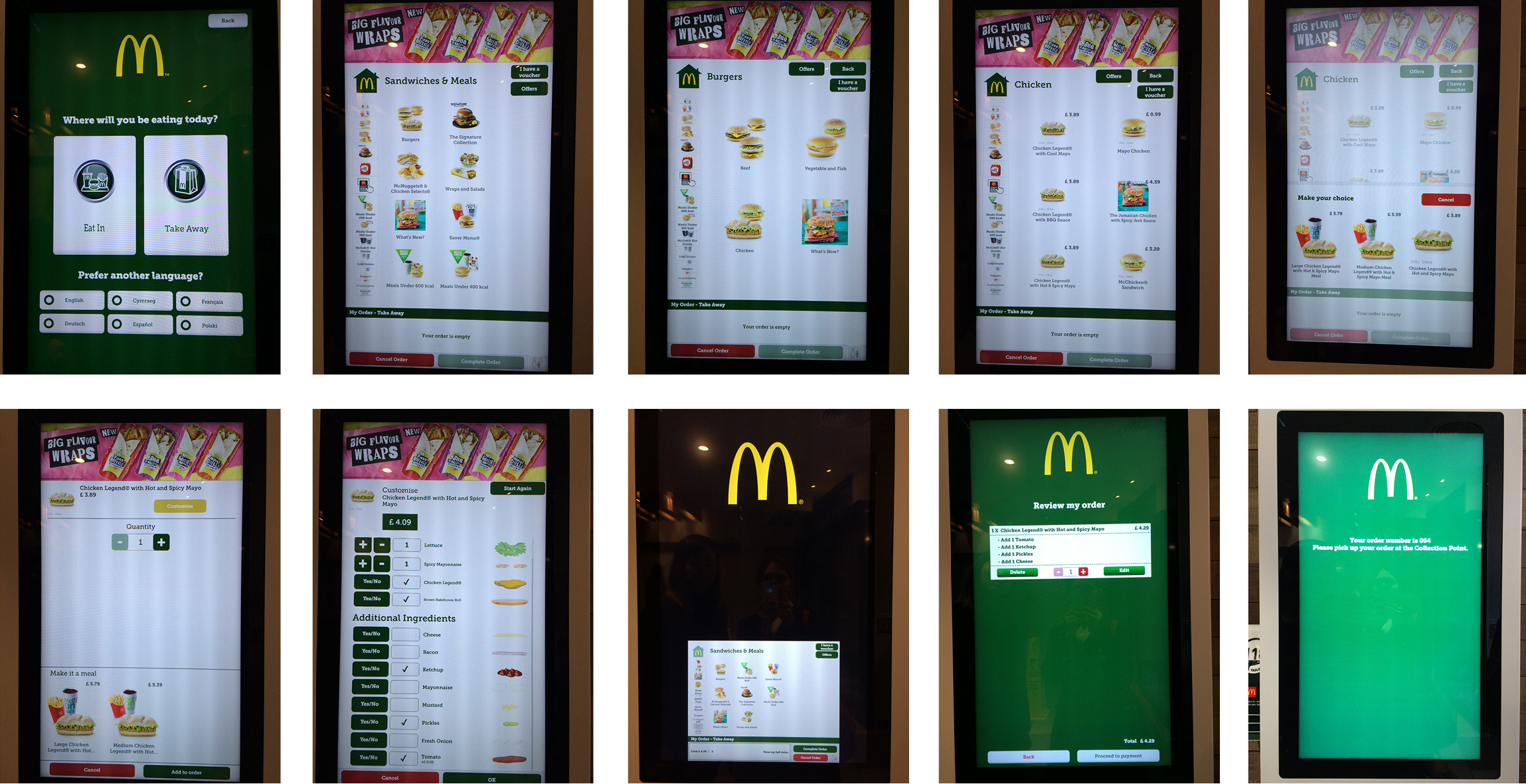
Before getting into user journeys or wireframes I will detail a bit about the research I did on competitors specifically 3 closest to Itsu as a brand.
We visited 3 stores in the area that provided self-checkout screens
KFC, McDonalds, Tossed. I’ll briefly list the pros and cons of each
MCDONALDS
Pros
• Very large large screens making it easy to see and browse
• Large and relatively clear UI or user journey
• Template design [a design that is created by the development company for any brand to plug and play]
that could easily be populated and rolled out
Cons
• Interface presented the user with too many options and too many taps to complete the purchase.
e.g. Carousel menu had too many categories with no icons or clear indicator what they were.
• Customisation required user to navigate multiple screen selections making the process longer. e.g. customisation included requesting condiments like ketchup
• Visually not on brand and a little untidy. A lot of buttons and actions user must carry out.
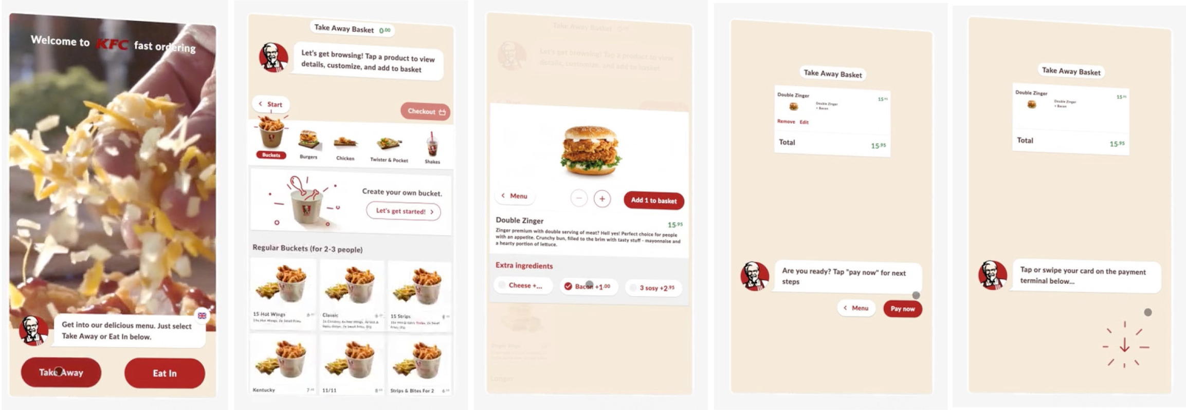
KFC UK & Abroad
Pros
• Visually on brand
• User interface had pleasing animations and interactions
• Very simple and fastest to navigate
Cons
• Different KFC’s [franchises] had different user interfaces and different styles making it not as unified across the brand.
TOSSED SALAD BAR
Pros
• One of the first stores to implement this technology
• Users could sit on a bench to browse the digital menu and order
• Visually on brand & pleasant
Cons
• Required user to login and create an account
• Payment at tills
• Small screen size [ipad]
• Ordering was not as clear or straightforward making the process of ordering the most complicated and took the longest

Ideation
Based on the competitive analysis research as well as multiple rounds of feedback from the executive board, the tech team & the shop operations team, we drafted the first rounds of user journey to feed back to the developer and to estimate how many pages of UI specs would be required.
Providing a rough UI based on the specs provided and client brief &
The full user journey in detail can be seen here

Design
Focuses of the design are approximately listed below
- As few taps as possible to make sure the customer spends under 90 seconds on the kiosk
- Simple steps that require mainly one action per step
- Welcoming look and feel as well as attractive visuals of the menu
- Simplified menu categories to reduce option fatigue
- Maximum number of products per page as hit rates drop for products on second or third pages
- 2 different user endings depending on if the user has ordered hot food for which they must receive a order number
- Non-disruptive voucher / discount feature so that students, NHS workers or voucher users could redeem their discounts
Based on the market research we also decided not to have any digital on-boarding. Self-checkout should be relatively self-explanatory step-by-step as on-boarding would take too long (Self-checkout at supermarkets and other competitors had primed the market to be used to this type of screen journey without any on-boarding).
No sign up or login (for repeat customers or to collect data) as this was too long and would be off putting to make customers looking for a quick and simple lunch purchase
Initial Variations for the 2 critical pages of the journey

Initial variants for the page just after the user choses between takeaway or eat in – Categories for the menu
Customer surveys and feedback from the operations team showed that there were generally 2 types of user orders:
Cold food pickup: Cold users would pick up their sushi from the fridge by the door, their drink or side and then go to the till to checkout. Most cold food purchases would opt for takeaway as there is additional VAT for eating in.
Hot food order: Hot users would go to the till, look at the menu screens behind the till, then queue to order their hot meal from the till. Once their order is made they may need to wait a minute to get their hot food. Hot may either eat in or takeaway with no difference to price.
By displaying the category menu before the user has a chance to see any products help navigate those 2 journeys more quickly as by default there is no single main meal category. It also helps reduce option fatigue and facilitates a quicker checkout

Variants for the menu page display and various locations for buttons, number of products, scrolling, category menu.
Both McDonalds & KFC (UK) had vertical scrolling menus, We decided against the menu displaying vertically on the left for the following reasons:
- our screens would be much smaller and narrower than those at McDonalds
- to maximise the product image size across 3 columns below
- separate the menu more clearly from the 3 columns of products.
During multiple rounds of iterations this was then refined to the designs below.
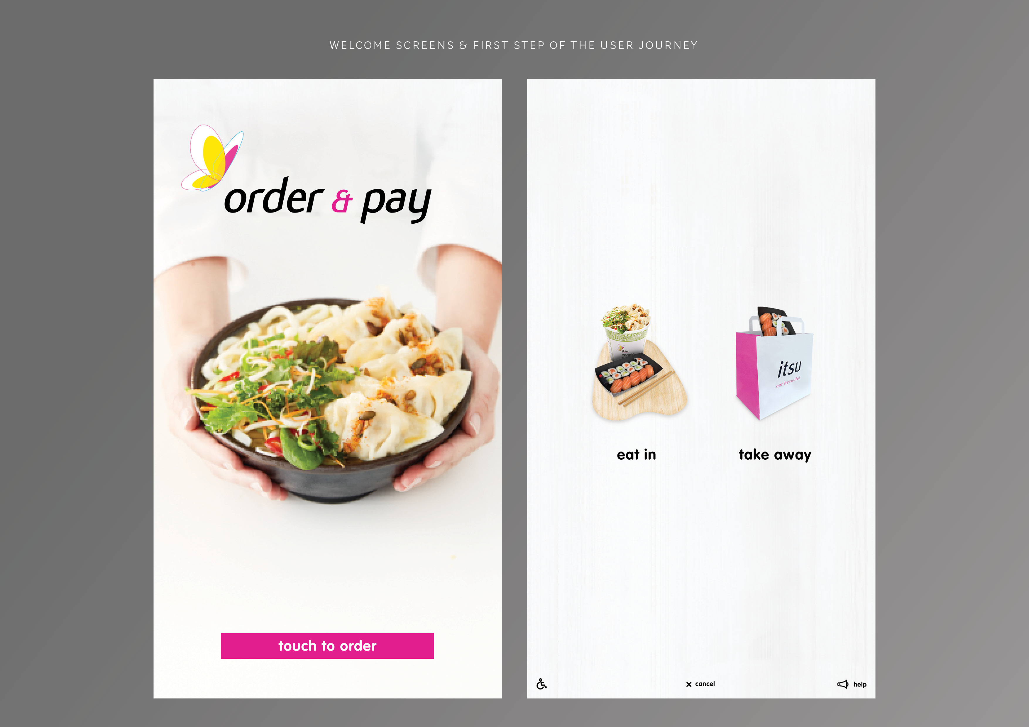
Welcome screen and first step selection

Menu categories and product selection

Checkout and payment process.

If users select only hot or only cold food they have a different end screen for their journey. The hot food pick up instruction needed to be very clear, so that the customer goes to the pick-up counter.
Testing & Results
Shop staff as well as head office staff were asked to test the first round of development and their feedback was incorporated in the subsequent versions installed first into a test store.
Once the trial store had launched and was successful, further developments were made on the next roll-out of kiosks for the next 2 stores in London.
OVERALL
• Users were able to make the entire journey in under 1 min for both
hot food order and cold food pickup journeys
• The user journey was simple and not confusing
• Hot menu information was easier to find, improving sales for hot items
RESULTS
• Business objectives were met successfully
• Checkout process was simpler and faster
• Fewer staff is now required to man tills
• Self-kiosk can be easily rolled out to other shops
• Hot items visibility and sales improved
FUTURE IMPROVEMENTS
• Improve the stats on second pages of products: either by having larger page arrows or page numbers at the top of the page, or with scrolling [development did not allow for scrolling in the v1-2a/b iterations of the design]
• Add a ‘popular’ or ‘new’ category to promote favs or new products
• More elegant button animations to make the experience more slick


Thank you for making it to the end!
If you have any questions feel free to DM me on instagram or email.
Support my work: Shop for original artwork + limited edition prints
 JANINE SHROFF