
Known as the ‘Gotham’ building, this building is a striking landmark of the Singapore skyline. The identity and branding have been developed to reflect its heritage and the style of the building.
- Identity
- Branding
- Digital
via Katana London
Ideation & Drafts
The building is a well known and iconic part of the Singapore skyline, so we wanted to design the logo that reflected the architecture and was recognisable as the Parkview Square ‘Gotham’ building.
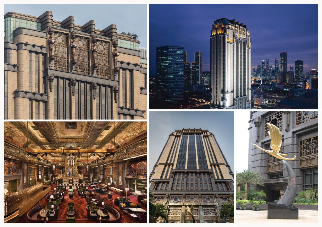

The client preferred route 1. but wanted the building to be more reflective of the building but still remain like a stylised icon.

We then spent some time coming up with many logo drafts variations of route 1.
The feedback was to take one of the routes and make it more 3D, which is the final version the client choose below. We choose a clean font with some thicker strokes to reflect the Art Deco style of the building and where the type lines would complement the icon above.

Premium application gold foiling on cream.
Brand Book & Applications
Repeating brand pattern created from the building window grill motifs to be used for print & web.


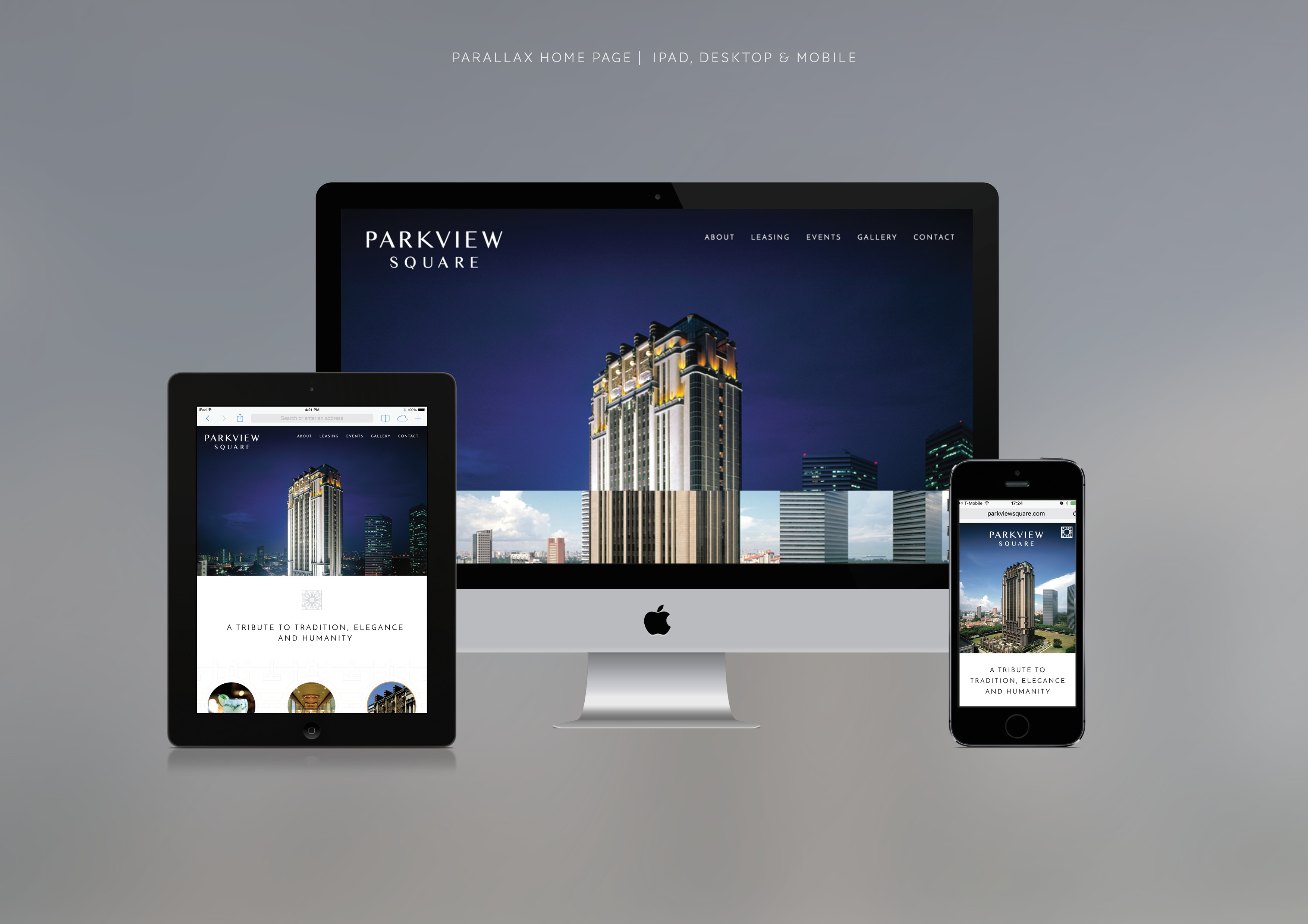
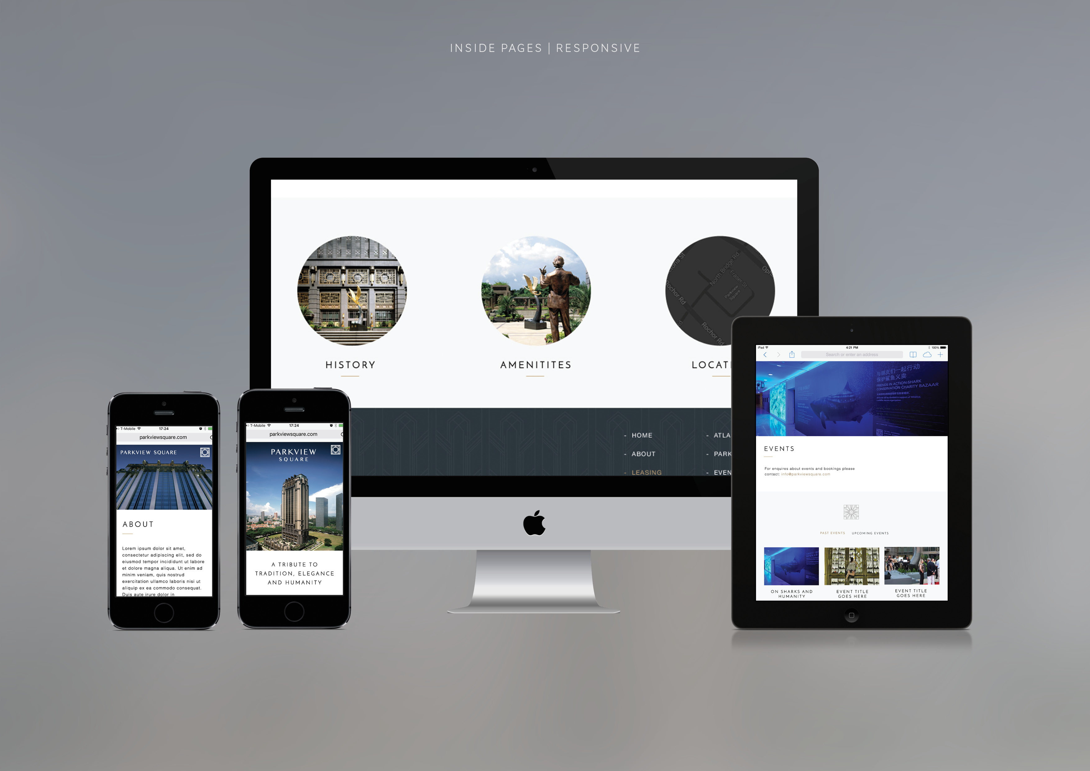
Website
We created and built a simple parallax website for the building, that could be updated by a custom developed CMS.

Thank you for making it to the end!
If you have any questions feel free to DM me on instagram or email.
Support my work: Shop for original artwork + limited edition prints
