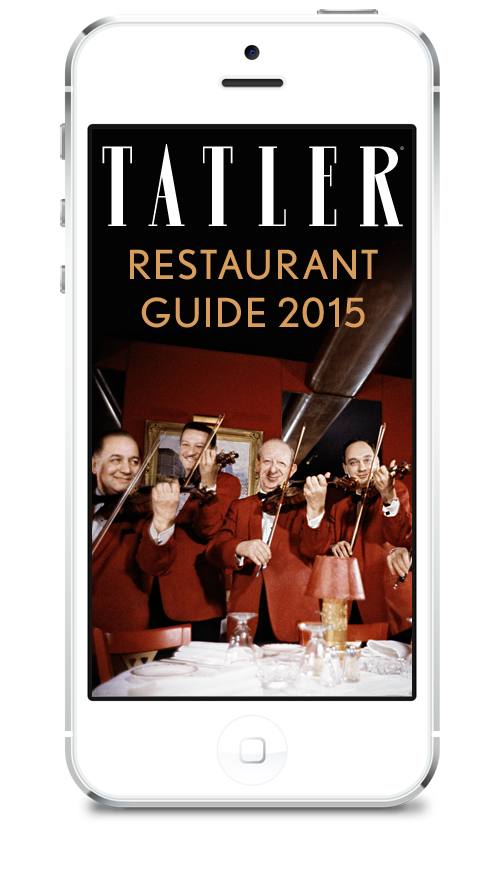
Collaborating with Condé Nast to create a mobile app for their flagship restaurant guide that features on the best of London’s cuisine.
Tatler is a British fashion and lifestyle magazine published by Condé Nast Publications.
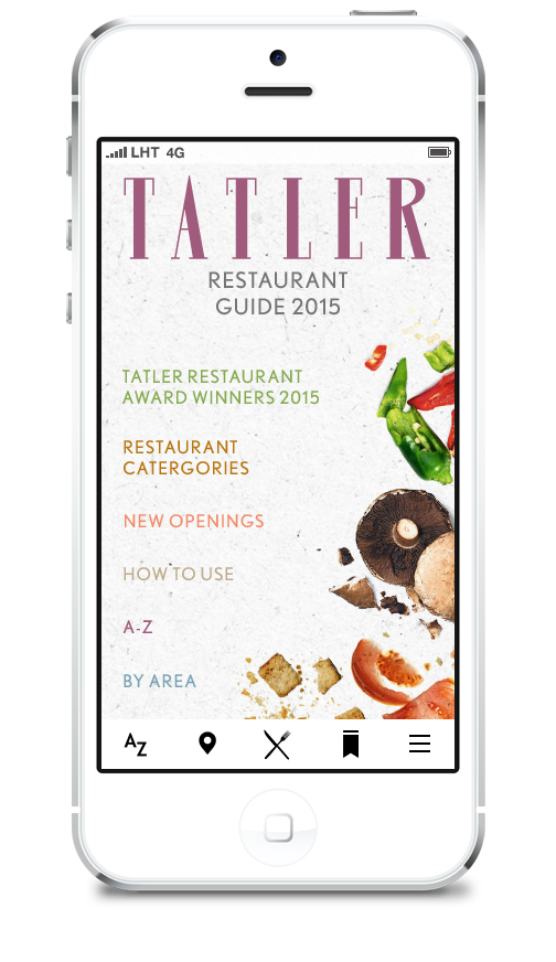
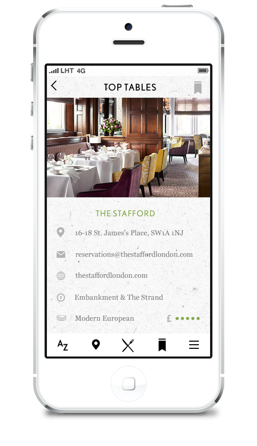
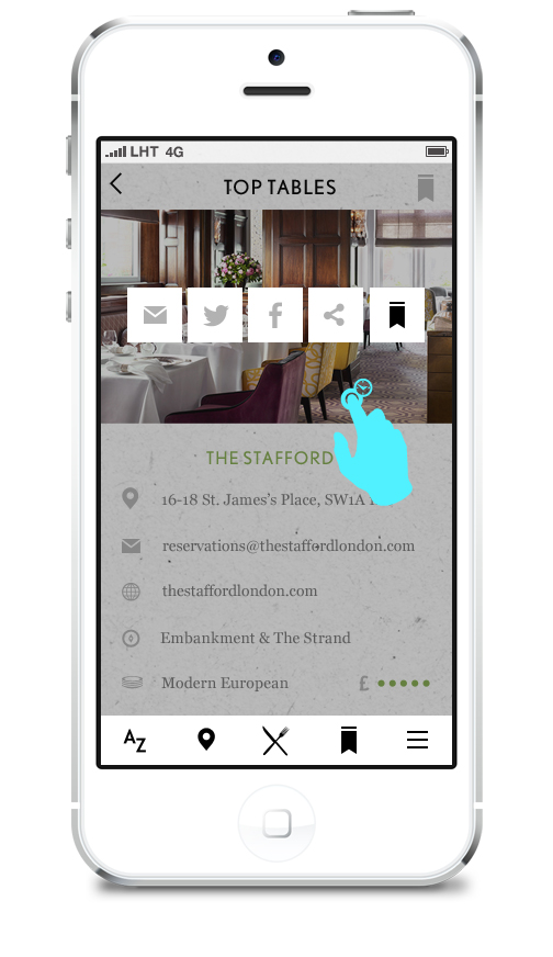
The app UI and UX was designed to reflect their print guides look and feel and to be as intuitive and useful for the user as possible.
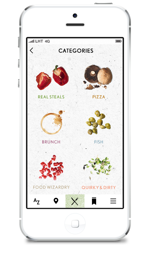
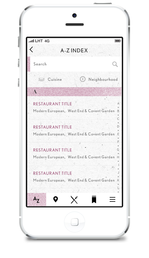
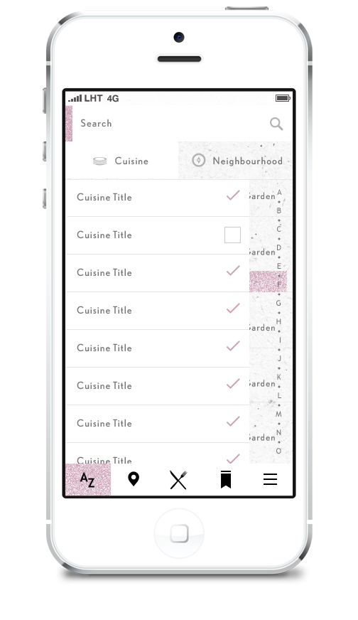
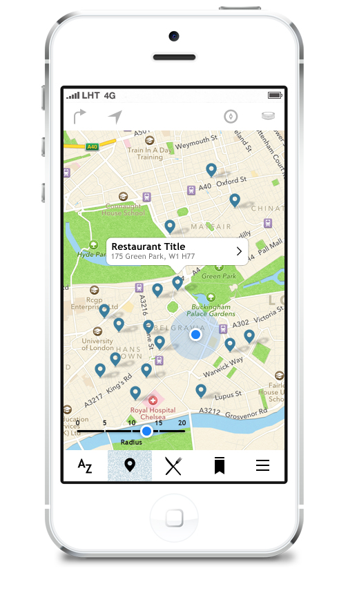
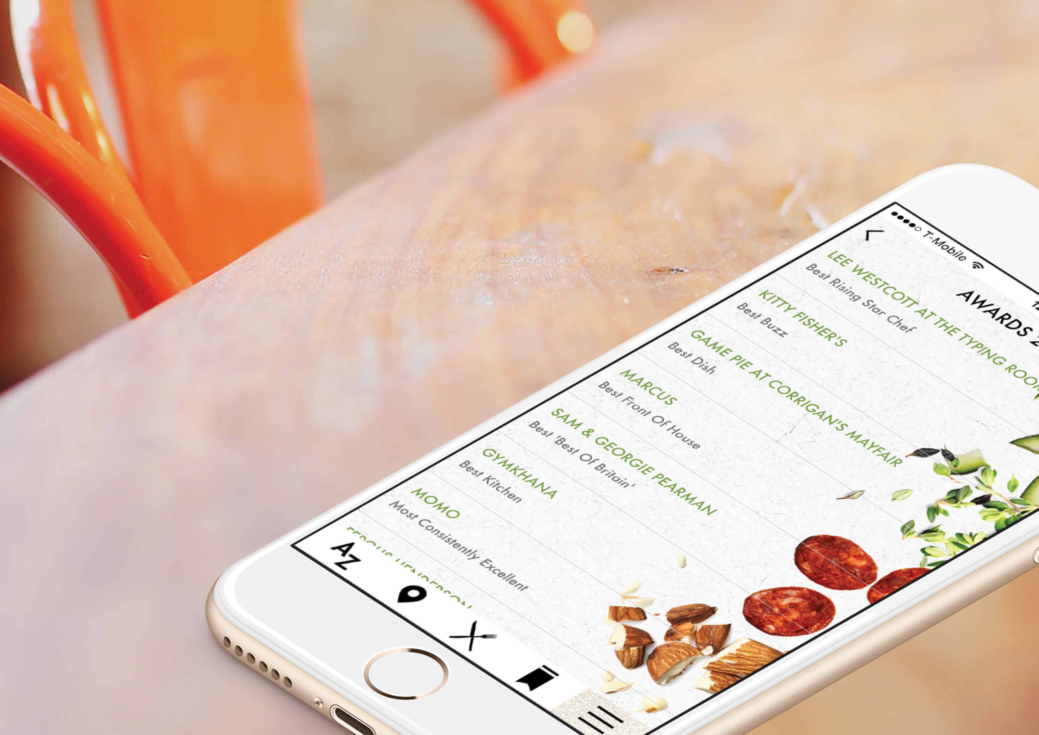
The user could browse restaurants via awards, top picks, A-Z index with filters, individual cuisine, categories and through location on a GPS map.
© Katana Creative Media
Overview
- Project type: Team project, collaborating with the client, the design agency director and 3rd party developer
- Duration: 2015
- Role: Designer, UI/UX, Q&A Testing
- Tools: Photoshop, Illustrator, Jira
- Result: Successfully launched the Tatler restaurant guide 2015 on the app store
Goals
- Launch a digital app version of the yearly Tatler Restaurant Guide
- Help the user navigate the restaurants by multiple methods: Category, cuisine, location etc
- Allow for quick and easy booking
Audience / Users
- Early to mid-forties, wealthy British upper & middle classes
- Interested in society, fashion and fine dining
Ideation
We created a flow-chart or user journey of all the pages as the first step to map out all of the content sections
The printed magazine had a hand made paper texture with a few ingredients around each category, to highlight aspects of the restaurant or the cuisines
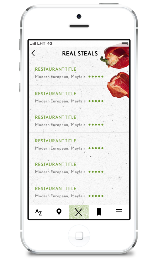
As the guide was mostly just a list of restaurants it was important that the app did not just look like a drab series of pages of text lists.
We used that style to define the category sections as well as a background texture on the category pages to give the pages of restaurant lists some character.
We did not include images of the restaurant on the listing pages for 2 reasions:
- to keep the style of the guide
- to allow for more restaurants per page
(small thumbnails did not really show the user anything, and large icons would reduce screen real estate)
We also used different colours based on the printed guide for the typography in each section so it was easily identifiable as the user was browsing each section.
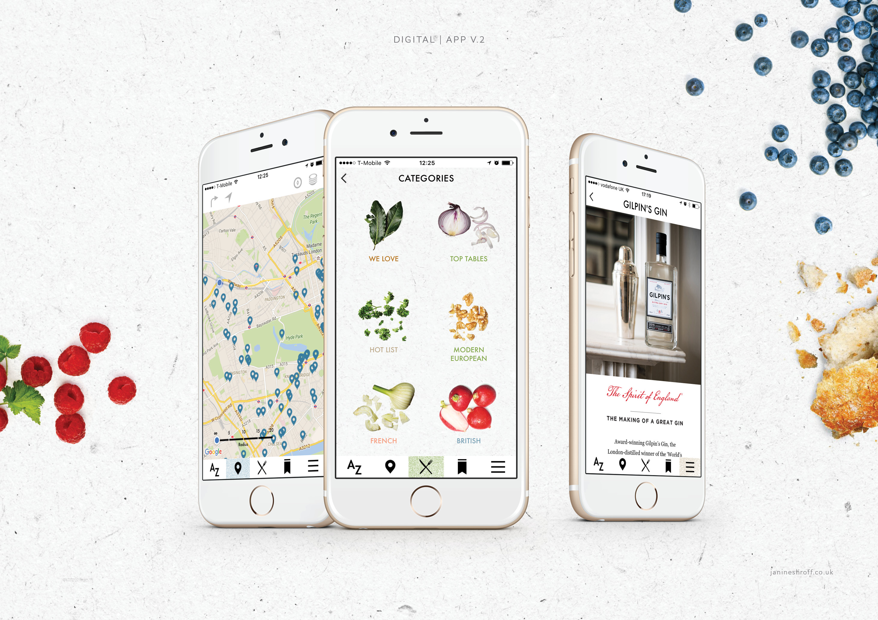
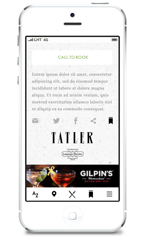
In-App Advertising Sections
We also created custom advertising sections within the guide, for various guide sponsors.
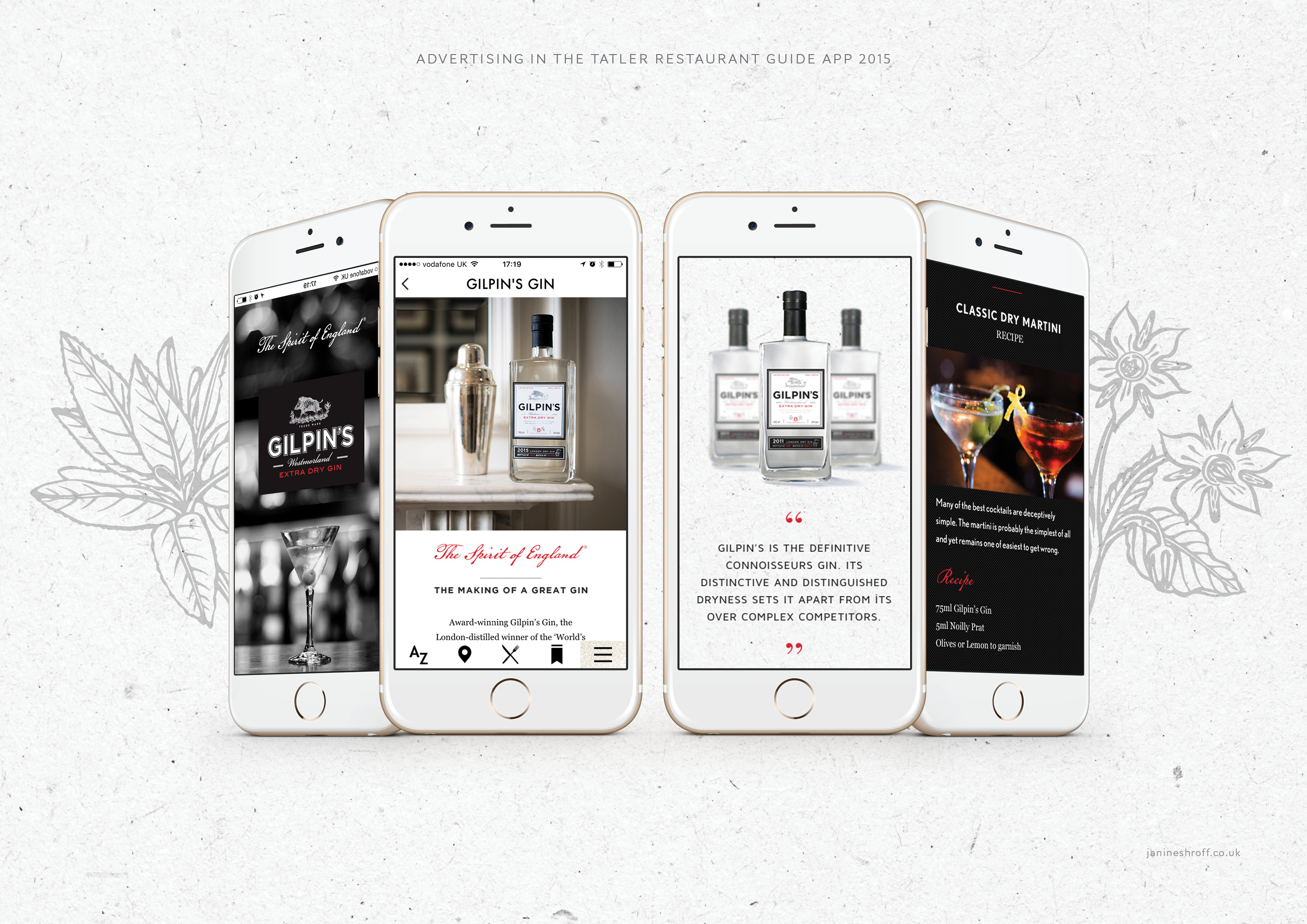
In-App Advertising Sections
App icons replicating the style of the guide.
Screens
Final screens for the app and a rough user journey