
Album cover illustration, logo and design for rapper B. Dolan. Released May 3 2024.
About the Project
“In the aftermath of an emergency spine surgery that radically altered his perspective and body, B. Dolan emerges after a four year hiatus from touring and releasing LPs with a new collection of songs, a new stage show, and a harrowing new story to tell.
Written during COVID lockdown and his quarantined procedure and recovery, “The Wound is Not The Body” (a title sampled from Adrienne Maree Brown’s poem ‘The Founding Wound’) winds through 9 new rap songs littered with strange characters, pandemic fatigue, autobiographical thoughts on hip hop, living and aging, and resolve in the face of new challenges.”
B. Dolan
Project Overview
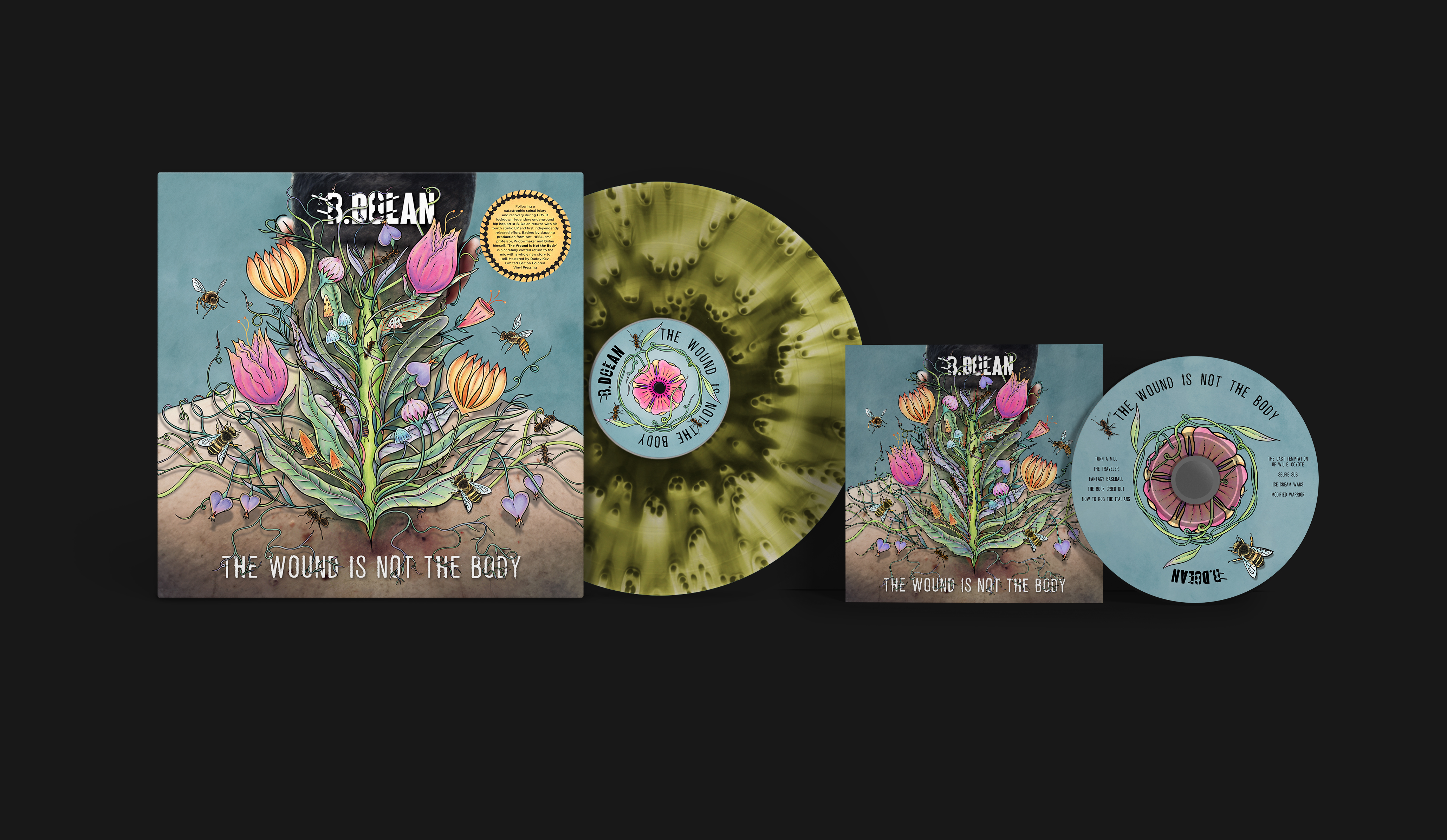
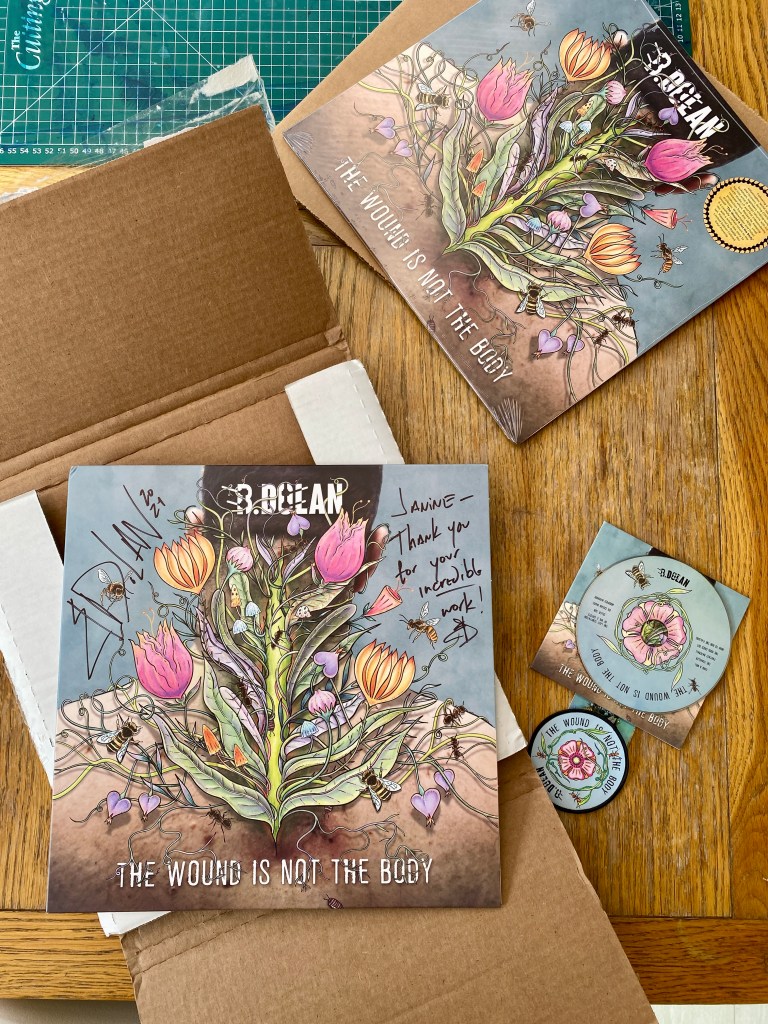
- Limited edition 12″ Vinyl Jacket
- Custom colour vinyl
- Album Logo
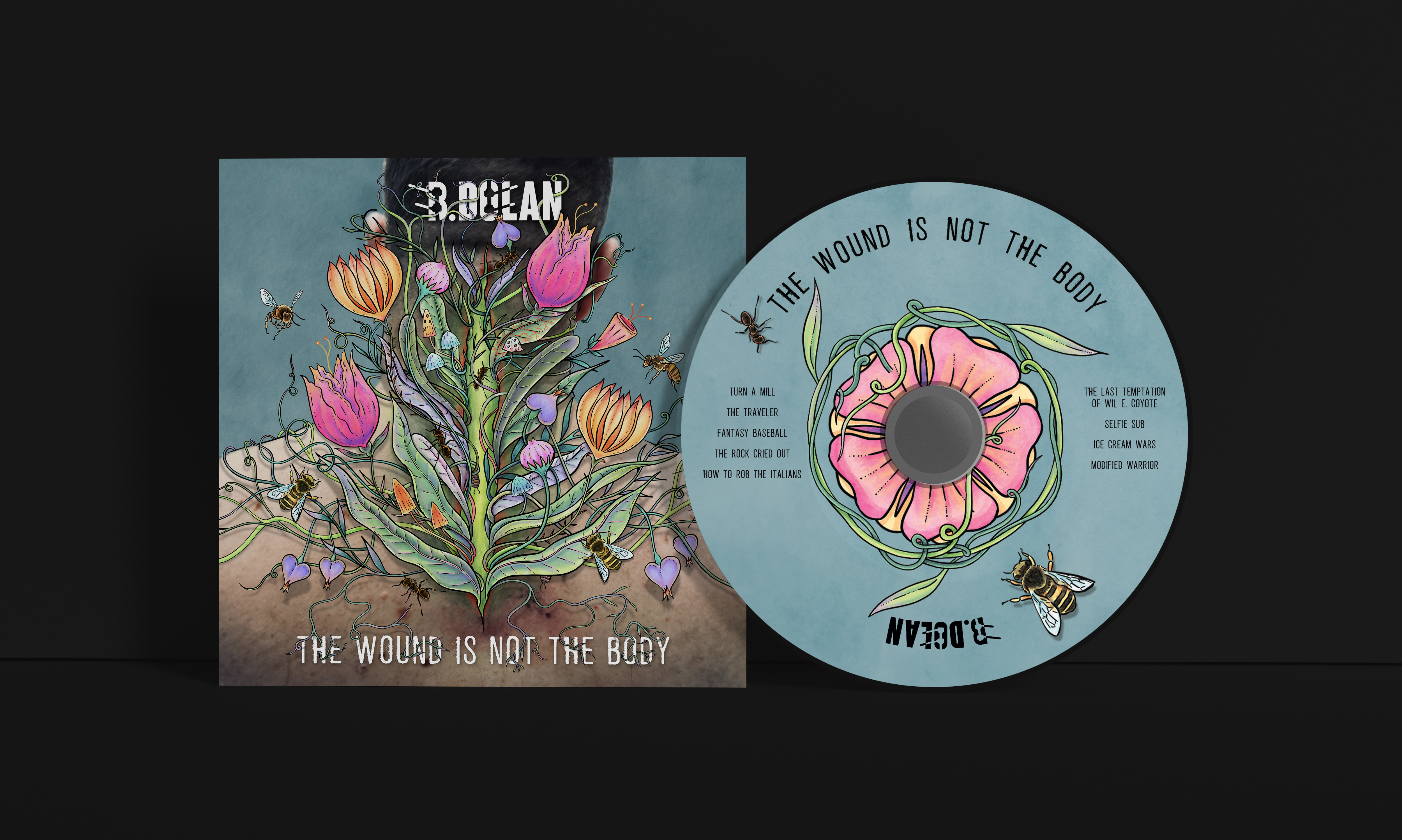
- CD Cover
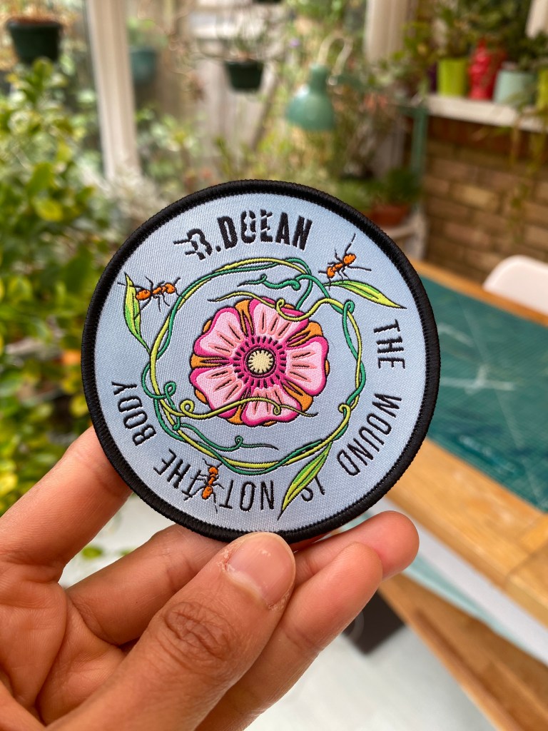
- Embroidered patch
- Sticker
Process of creating the Limited Edition 12″ Vinyl Record
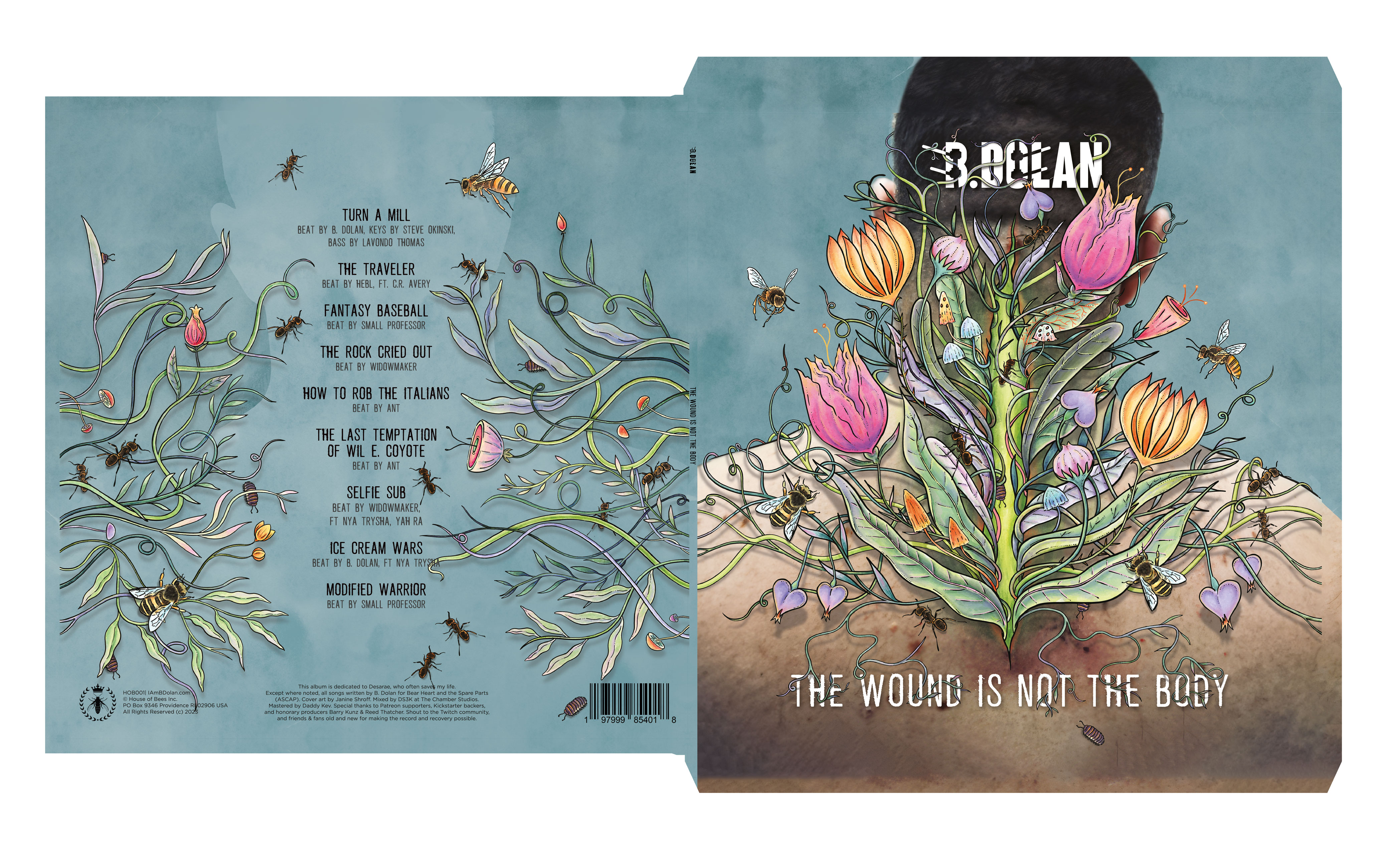
When we started the project B. described having a vivid vision about living things growing out of a wound in a tree, with vines and insects came out of it, alive and growing – Which became the core concept of the album cover.
“The current working title of the album is “The Wound is Not the Body”, from a poem by Adrienne Maree Brown I read during the recovery process.
I was possibly imagining an illustration based on this photo, transforming the wound into something like a tear in the earth with organic stuff growing out of it, or somehow visualizing the body as healing / growing / repairing. I’d also be happy to send some music along once we’ve talked more.“
B. Dolan
Rough Sketches & Works in Progress


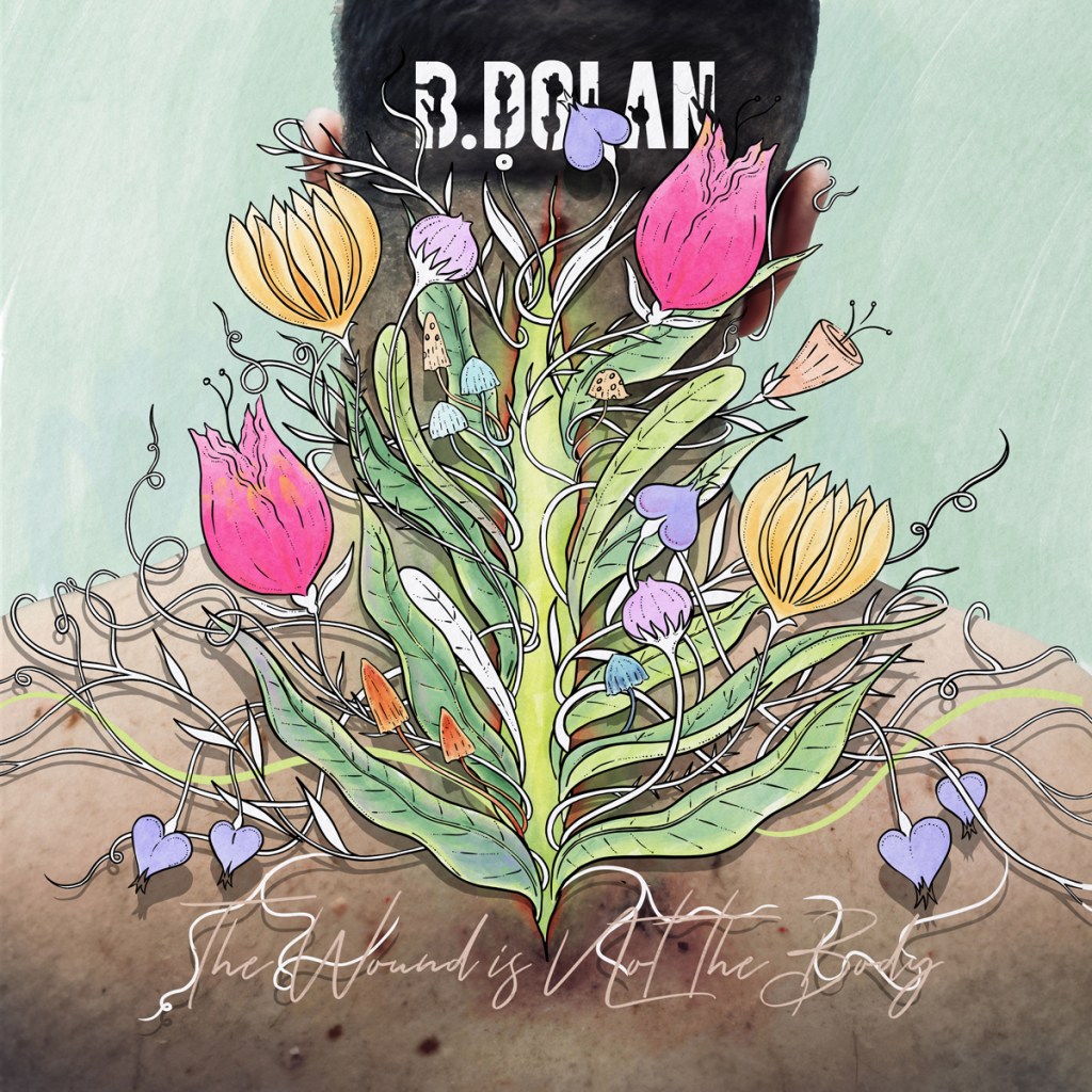
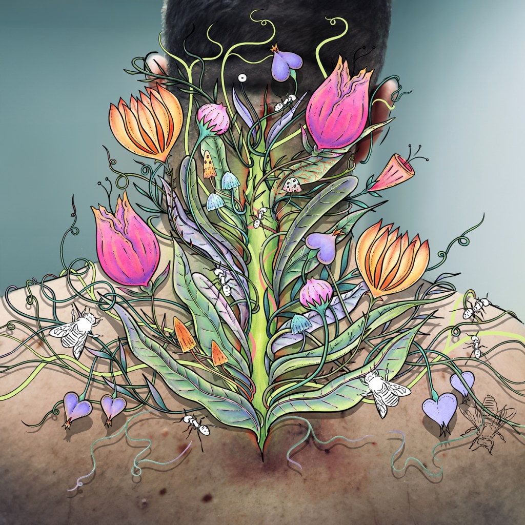
Originally, the album was meant to be fully illustrated. After B. showed me a photograph of his back from the hospital visit (for reference), we discussed using the actual photo with the illustrations woven through it. This felt more powerful than trying to merely recreate the photograph as an illustration.
I had to experiment with a few different line weights across drafts so that the outlines stood out against the photograph.
The logo of his name (B. Dolan) was based on X-Ray references sent by B. Dolan about the steel rods in his back and spine. Their shapes make up the negative space in the letters, tying it back to the cover illustration.


The design of the front and back of the album cover echo each other, the vines and plants looping around his body, with the album songs on the back laid out in the center like a spine on the faint outline of his torso and head, mirroring the front.

I used the curling vines, flower and insects on the labels inside the LP, CD and the sticker, using the physical punched hole in the centre as a focus (or the “wound”), like they were growing out of it.
We also chose a custom pressed vinyl with a green translucent effect to best match the theme and the cover design.
Embroidered Patch, based on the design on the Vinyl Record
Logo Creation
The logo of his name (B. Dolan) was based on X-Ray references sent by B. Dolan about the steel rods in his back and spine. Their shapes make up the negative space in the letters.
Vinyl Sticker
Limited edition LP also had a custom sticker. The border around the sticker also references the steel rods.


Thank you for making it to the end!
If you have any questions feel free to DM me on instagram or email.
Support my work: Shop for original artwork + limited edition prints
