
The AM Institute was a private members club for health and was set up to help men in their 40’s, 50’s & 60’s enjoy their life as much they did in their 20’s and 30’s.
We created the brand identity, branding, stationary, strategy, dual function health app & members portal, merchandising and advertising concepts.
- Branding
- Digital
- Merchandise
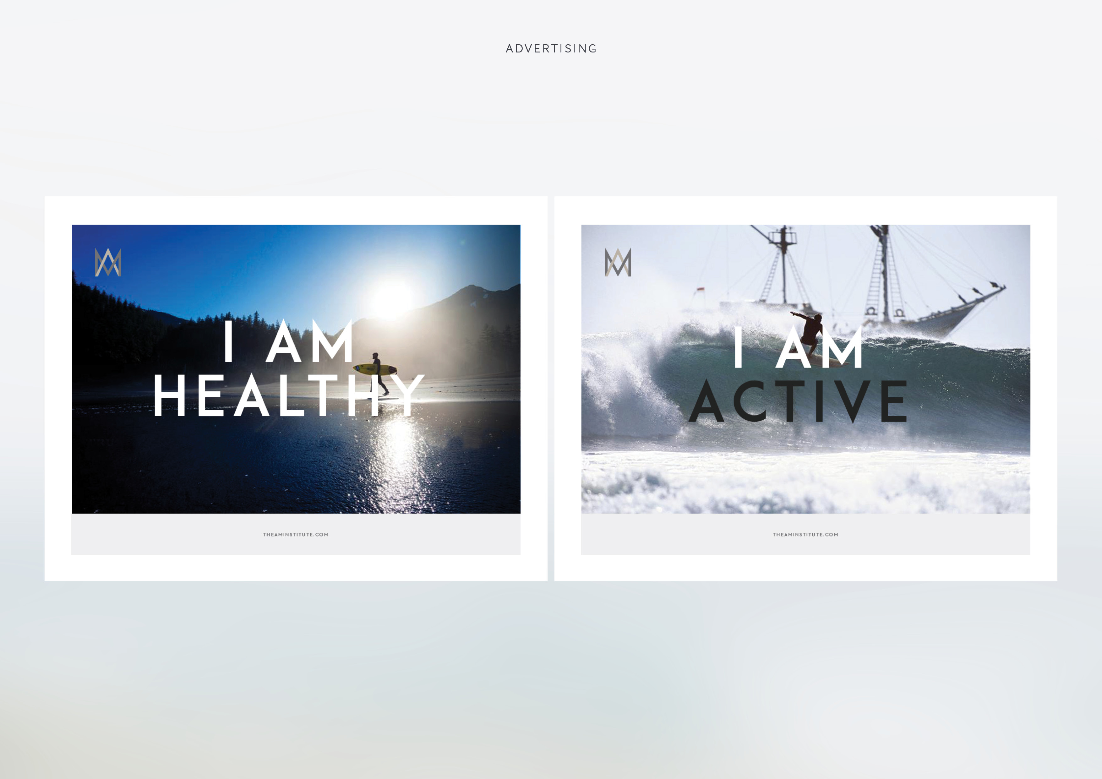
- Advertising
via Katana London
Identity
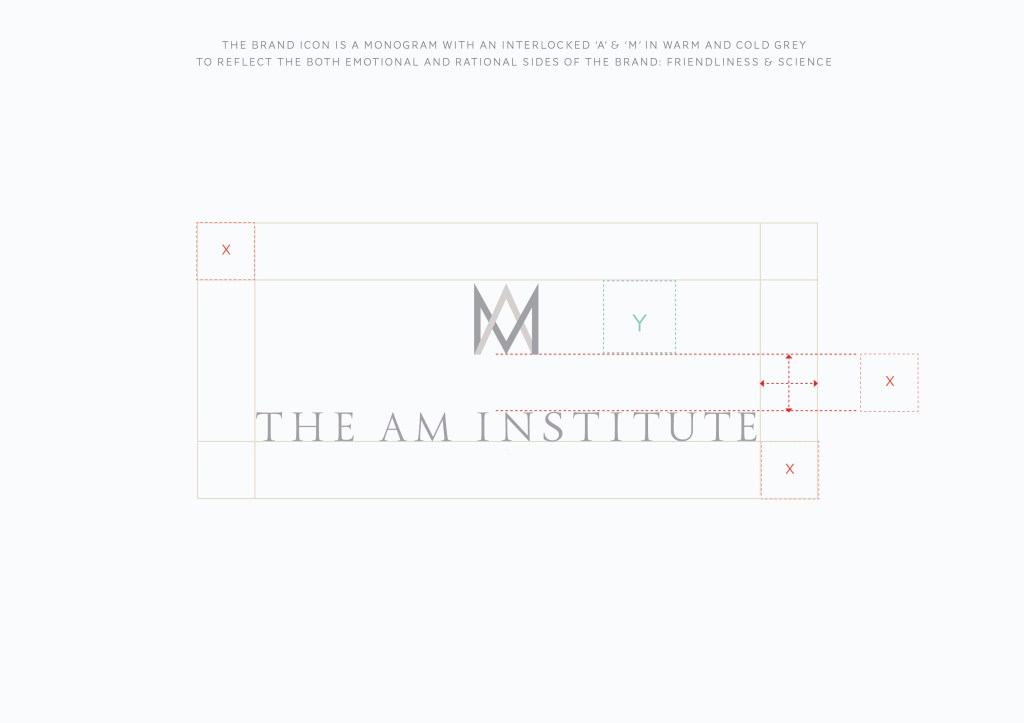
The brand icon is a monogram with interlocking ‘A’ & ‘M’ in a warm grey and cool grey to reflect the brand proposition of emotional wellbeing, while cool grey was used to reference science and medicine.
The icon was also designed to give the impression of a crown.
We went through many iterations to refine both the word mark and the icon to achieve a balanced and proportional icon using the ’A’ & ‘M’


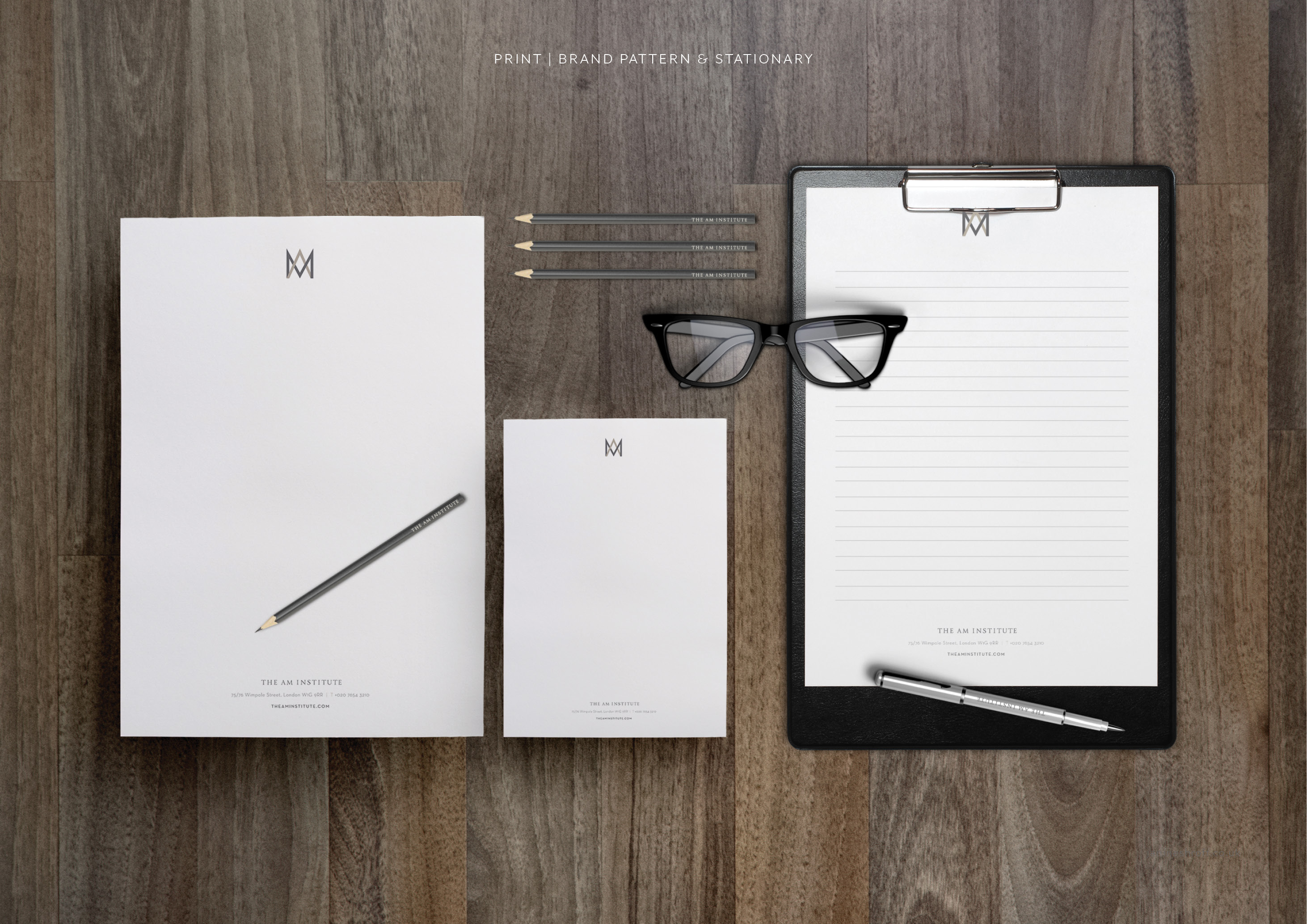
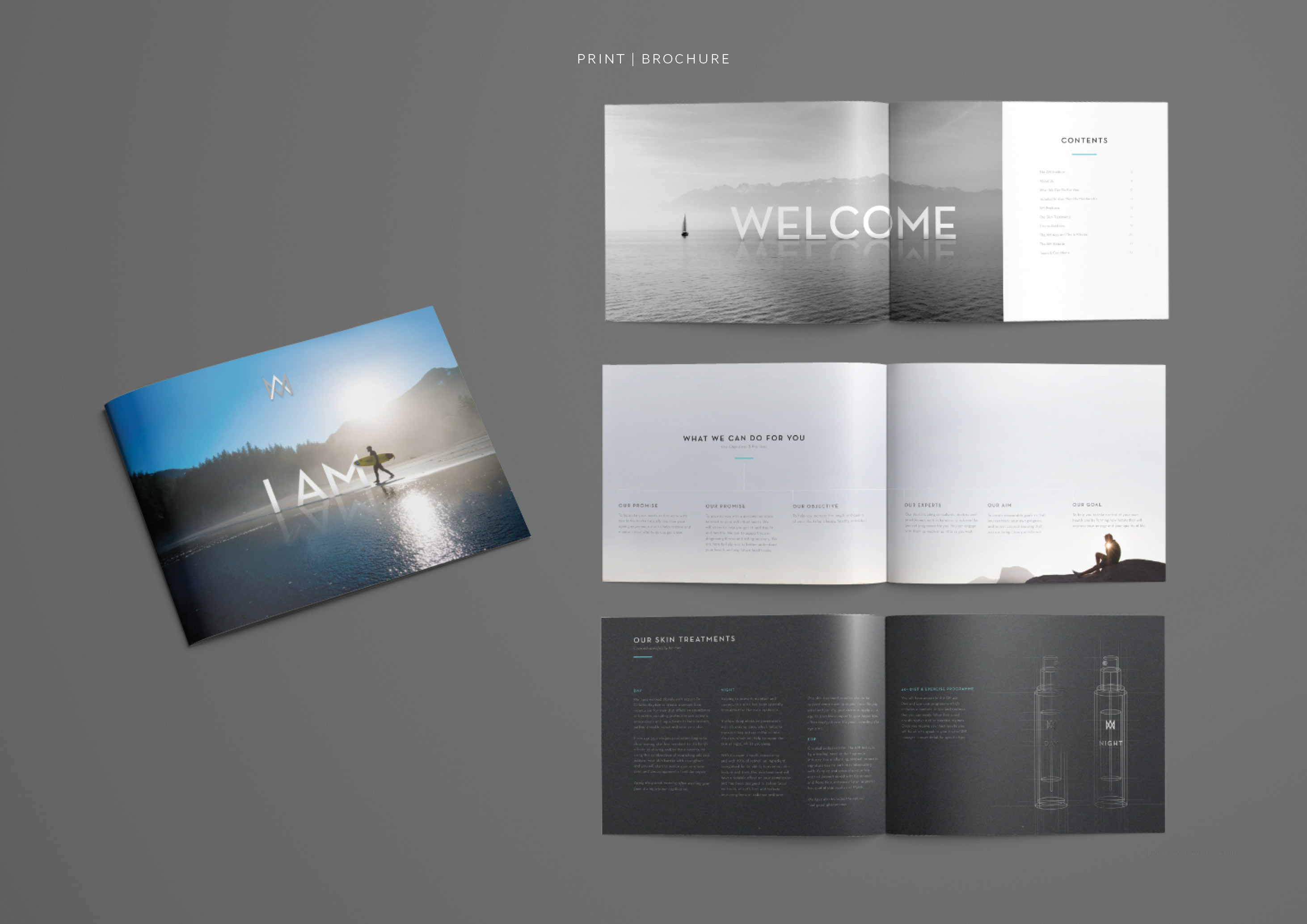
Stationery & Print Applications
The premium business cards were duplex grey and white with the logo foiled in 2 different tones to match the 2 tones of the identity.


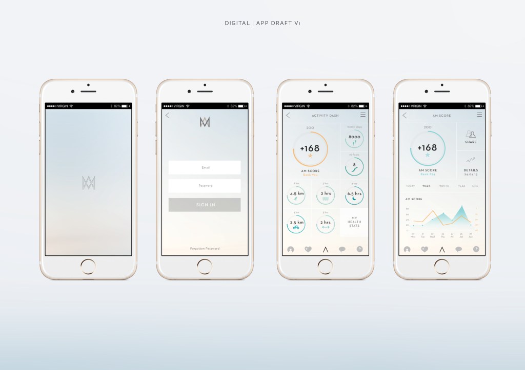
App Concepts for a Health & Lifestyle App
The user taps the logo to access the 2 different sides of the app. Light version a fitness and health app that can monitor heart rate, steps etc and a Dark version that shows the user curated mens health lifestyle content
An activity monitor using the ‘A’ from the logo. Logo Button toggles between health & member sections of the app.

Advertising Concepts
Advertising concepts based around the tagline ‘I AM’

Thank you for making it to the end!
If you have any questions feel free to DM me on instagram or email.
Support my work: Shop for original artwork + limited edition prints
