DryBy is salon just off Regent Street, that offers a range of luxury hair treatments and nail art experiences.
To launch their business and brand, they wanted to create a blow-dry app that reflected their premium proposition with a unique ability to bring the DryBy blow dry experience to the users at home.
At Katana we helped establish the brand when they were a start up with their branding, identity and digital.
To see the branding case study please go here.
DryBy has been featured in Goop and Harpers bazaar among many others as one of the best premium hair and nail salons in London.
Overview
- Project type: Team project, collaborating with the client, the design agency director and 3rd party developer
- Duration: 2015/2016
- Role: Designer, Branding, Print, UI/UX
- Tools: Photoshop, Illustrator
- Result: UI/UX for a customer blow dry service where you can either book for a blow dry at home or in the salon.
© Katana Creative Media
THE PROBLEM
• Home bookings would only be available to a certain area of residents, others must be directed to book in salon
• Encourage the user to book by making it as smooth a process as possible while navigating many choices
• Retain the users who do not fall into home booking to book in the salon
Business Goals
• Reflect the premium proposition
• Create a blow dry booking app that stands out in the market
• Offer customers a way to book quickly
Design/User Goals
• Make it easy for the user to book a blow-dry either at home or in the salon
• Make sure users are not put off while navigating booking at home restrictions
• Provide a brand experience that showcased their blow-dry styles as well as a booking function
Average User
During the branding exercise we narrowed their customer base to
• Regular users: Affluent, professional women (ages 30-55) who may want a blow-dry regularly
• Occasion users: Users booking a blow-dry as a group for special events e.g. special night out, weddings etc
Environment
West London
Competitor Analysis
At the time there were only a few blow-dry bars that offered a premium experience and no other direct competitors offering at home booking in app store. We went through a few salon booking processes, including some salons on the web, of each to see which ones were the easiest to navigate. These were some of the other blow dry apps available below.
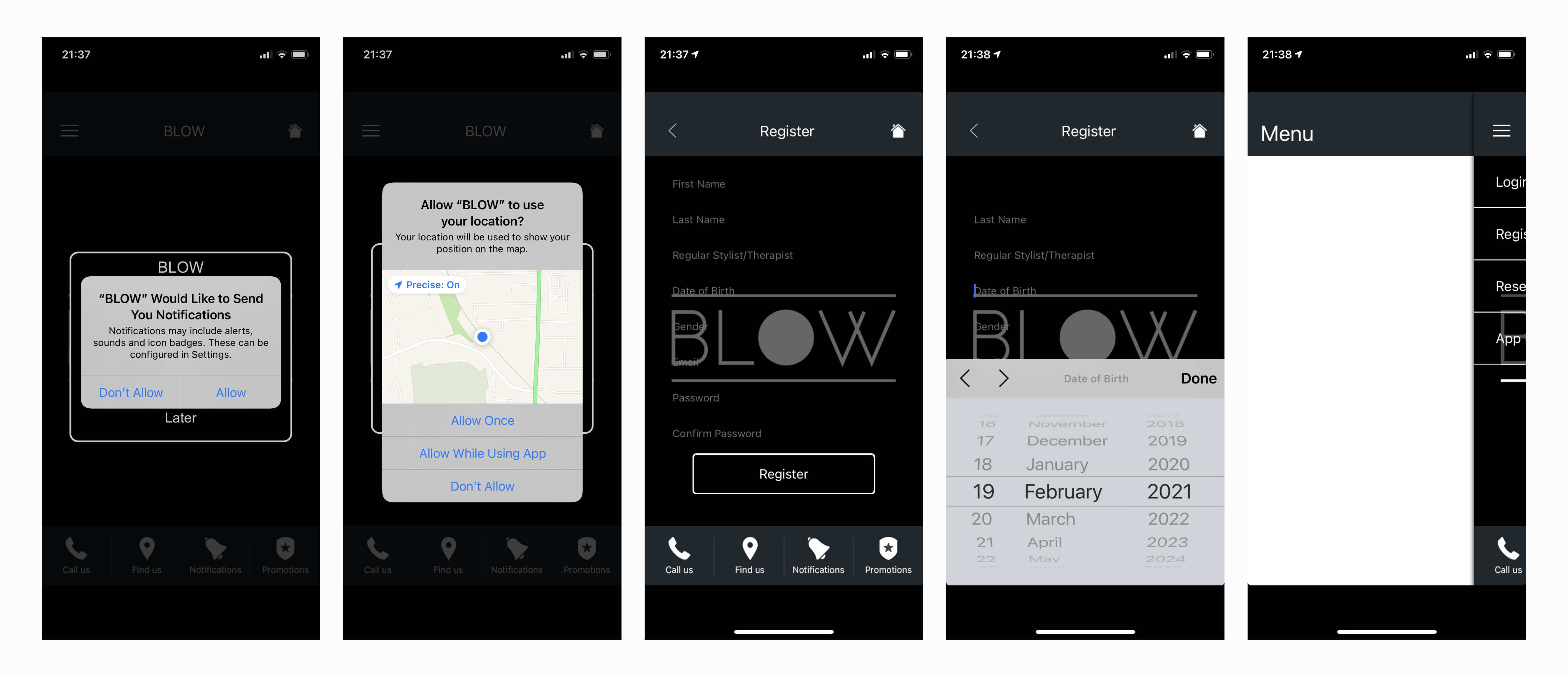
BLOW
• On opening the app there is a flurry of pop-ups and prompts
• There is very little other information on the app
• Brand experience is poor
BLOW Ltd
• On opening the app there is again a flurry of pop-ups and prompts
• User is pushed to register before they see any services
• Menu at the bottom is quite clear
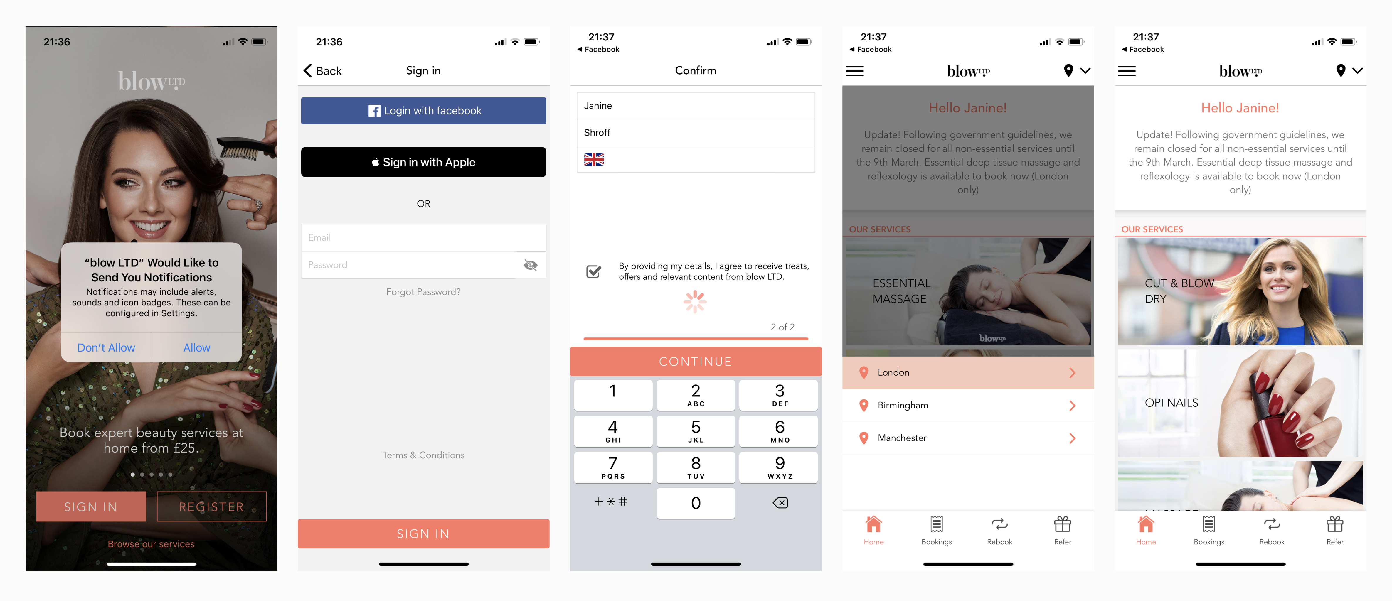
The primary difference in some of the apps, was requiring users to register before they even got to the booking criteria.
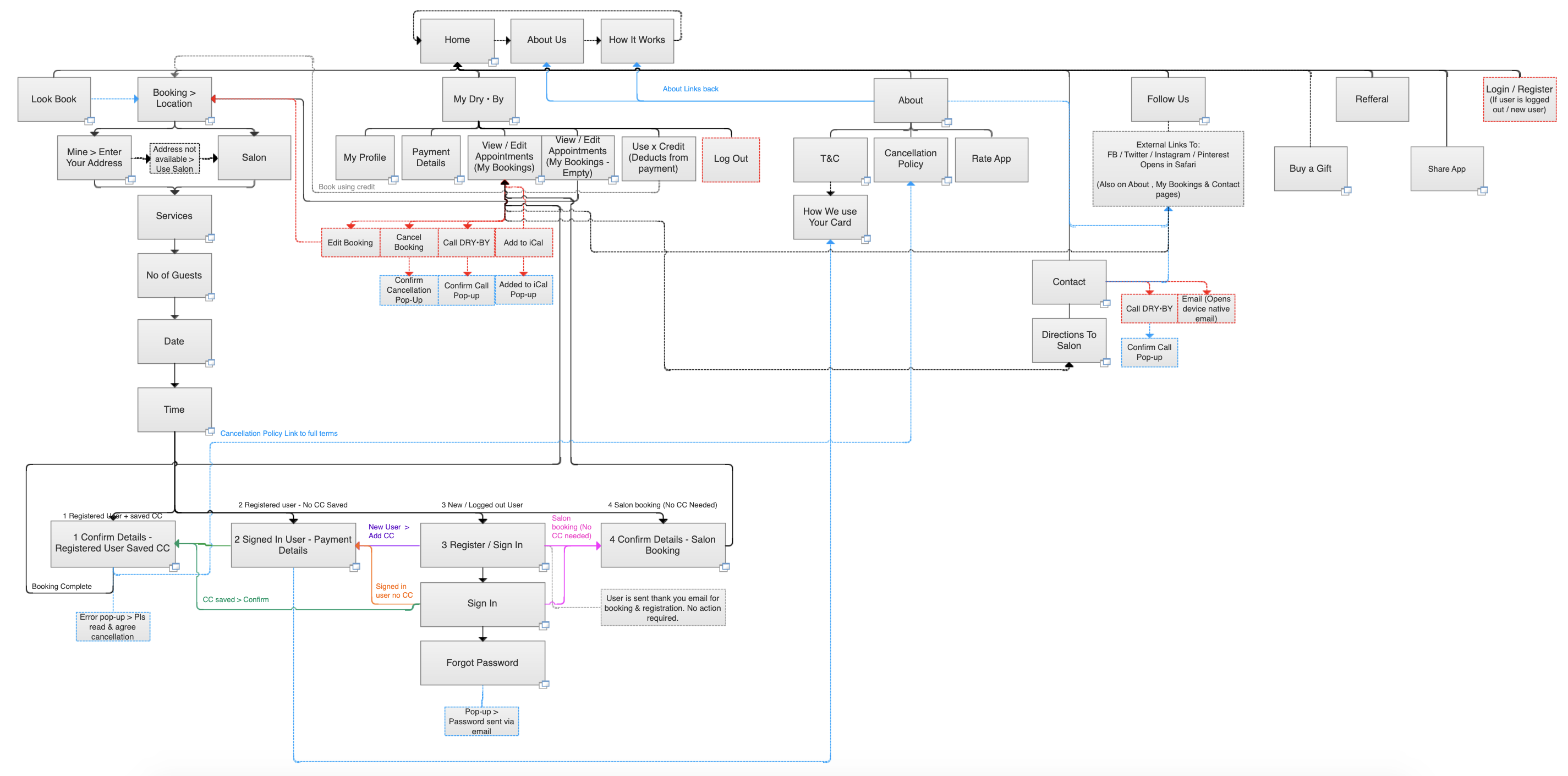
Ideation – Wireframing & Prototyping
As we had already established the brand identity and look and feel (see branding case study here) and the purpose of this app was to facilitate bookings, we focussed on the UX first, creating a fully working prototype that went through many iterations to get to the final result.
One key decision was based on our research of the competitors and on testing from the client we decided against forcing people to sign up and register before they could even browse the app as this was off-putting and cumbersome especially if the user wasn’t sure if they were ready to book. As this brand was a start-up it was more beneficial for allowing users to browse through to app get and sense of the brand as well then getting their payment details before they could view the services.
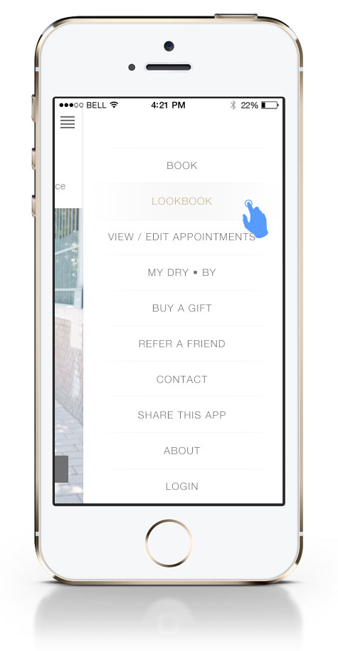
• Core functions of the app to be the only 2 buttons: ‘Lookbook’ & ‘Book’
• All other app functions and options put in a hamburger menu
• Make the multiple steps to book a blow-dry clear and easy to navigate
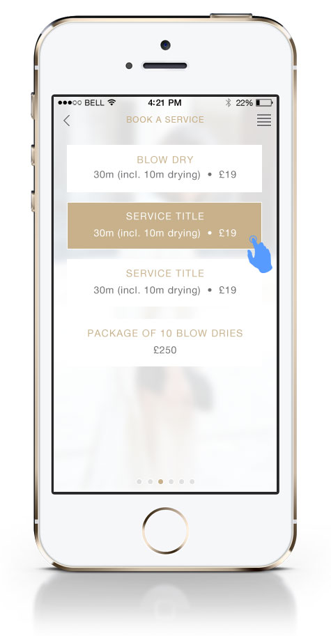
• Blow-dry options broken down into simple to navigate steps
• To reduce drop-off, registration for users only once they reach the end of the booking process and complete their card details
• No repeat entry of card details for return users
Complete user journey: Detailed wireframes can be viewed here
Prototype: To play the prototype open this link on your phone

Design
Focuses of the design are approximately listed below
- Highlight the essense of the brand through the UI
- Premium look and feel
- Main objections see wire-framing bullet points listed above
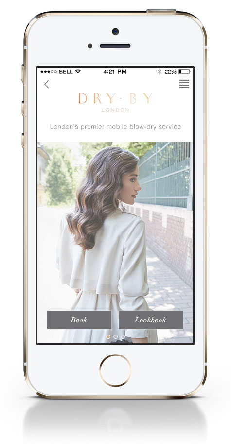
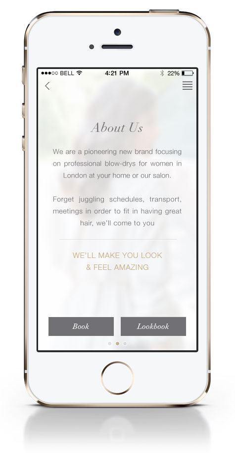
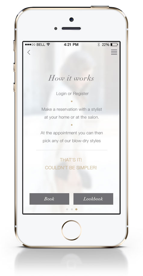
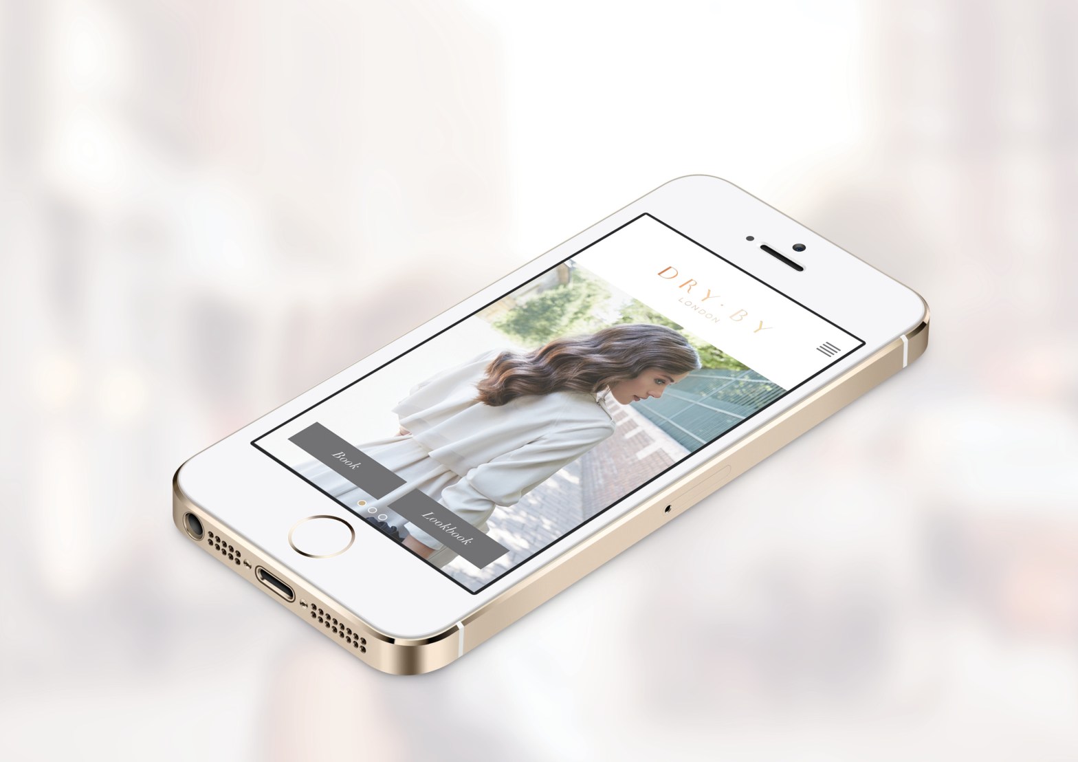
Home page with main app buttons, Swipe the home screen left or right to see the about and how it works pages.
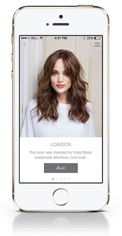
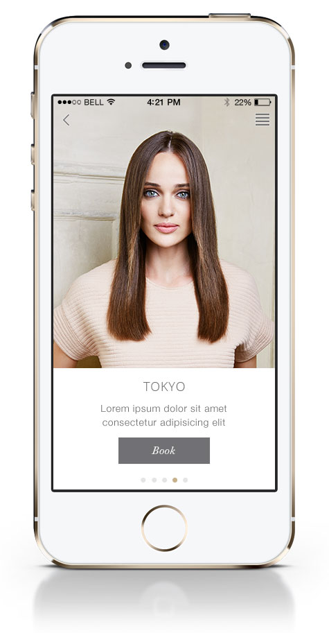
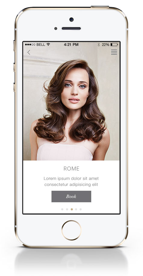

Look Book page. Swipe left or right to view the 5 styles


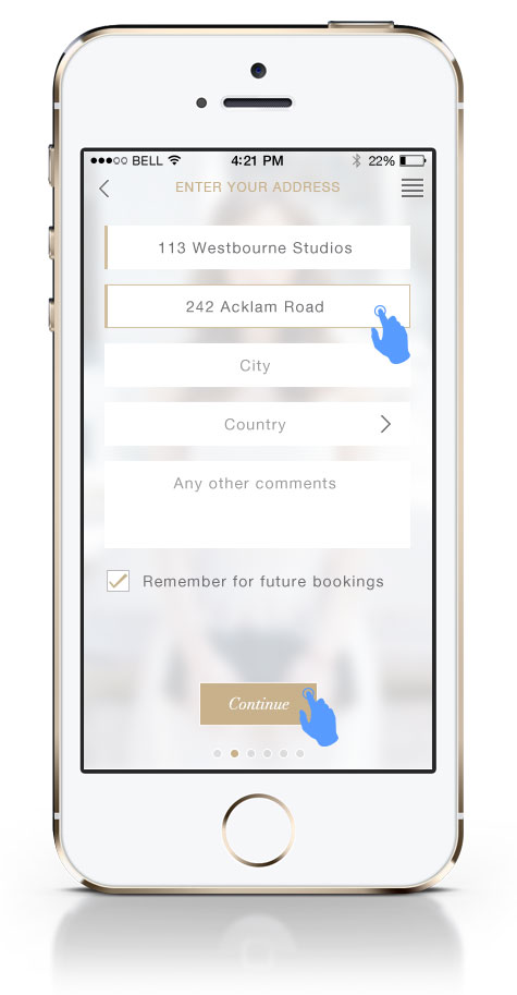
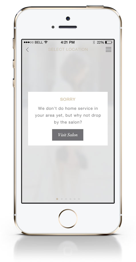
When users click on the ‘book’ button either from the lookbook or from the home page it starts the booking process. If the user selects the home service and it is not available in their area they are prompted to call the salon.

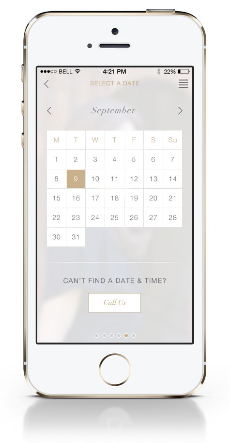
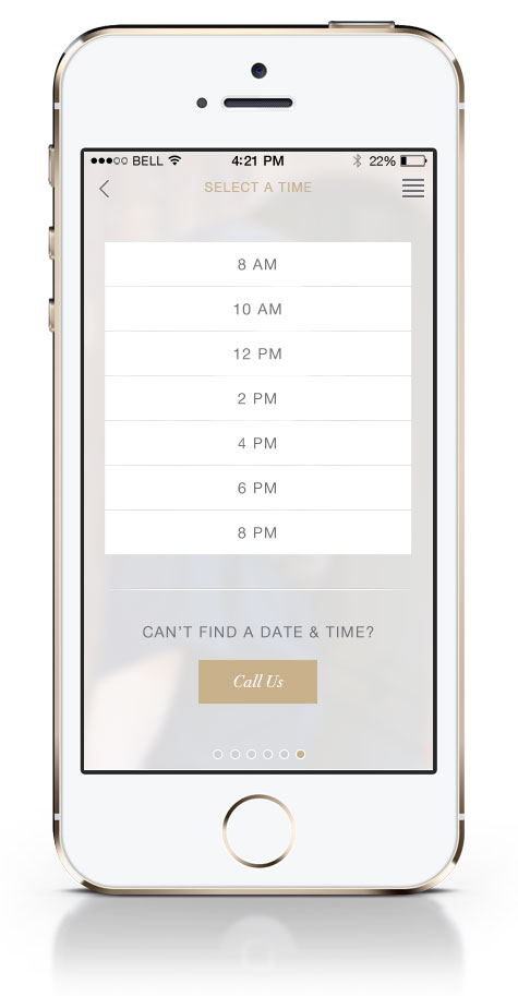
Booking details, date and time option
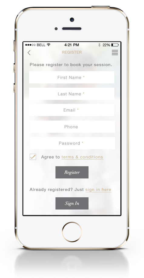
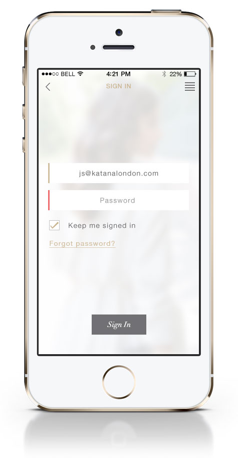
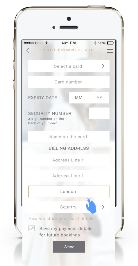
Most users would be new so we took them straight from the confirm booking to registration. If the user was already running the app they’d be signed in automatically and if a minority had signed out there was a link to sign in again. Salon bookings did not require card details but home books required payment details to book.
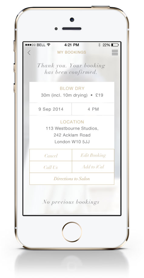
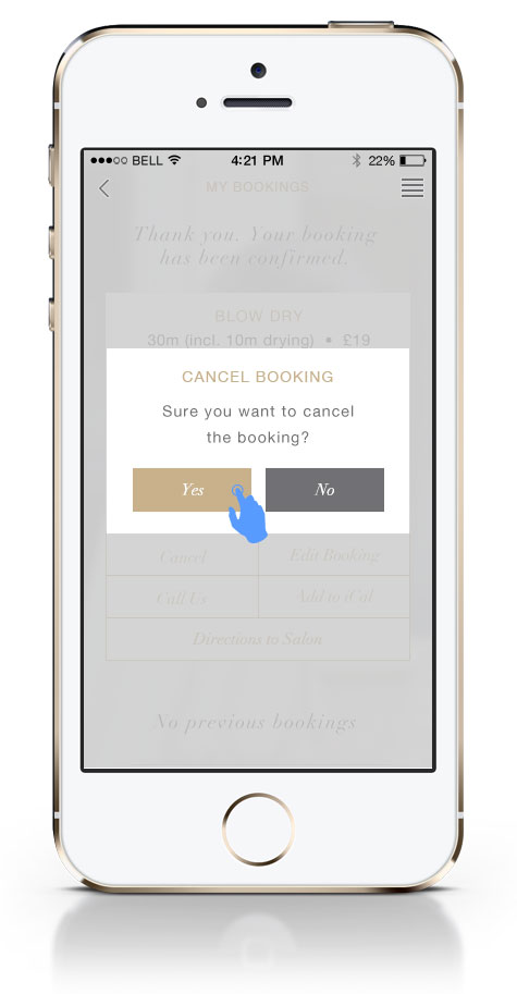
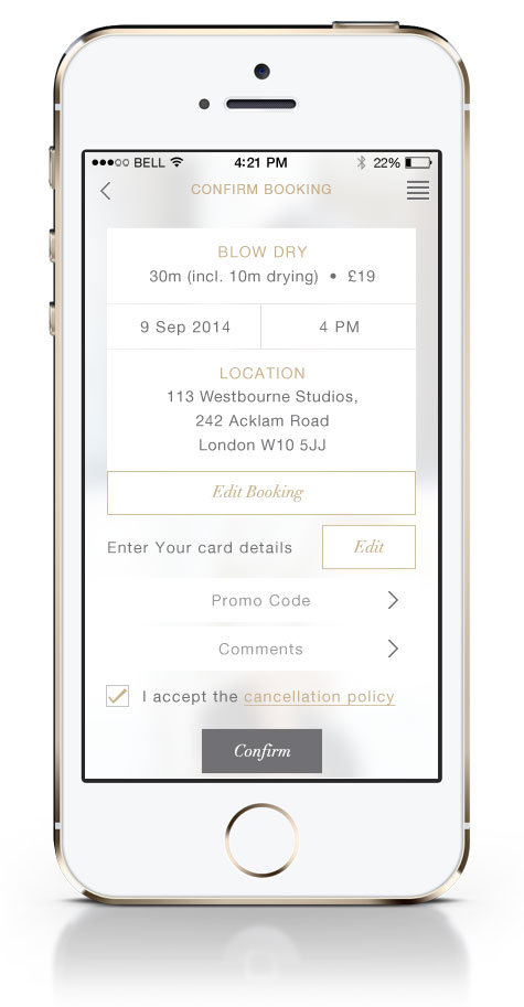
Booking confirmation page. The user can edit booking details or cancel booking. My Bookings page also prompts new user to make their first booking. Once the user has prior bookings they will display under any current booking details
FUTURE IMPROVEMENTS
• Improve contrast of the copy and buttons
• Simplify the menu and improve my bookings area to facilitate easy re-order or previous bookings
Thank you for making it to the end!
If you have any questions feel free to DM me on instagram or email.
Support my work: Shop for original artwork + limited edition prints
