
DryBy is a blow dry and nail art studio located in central London. DryBy’s aim is to transform the traditional blow-dry and nail experience for the discerning modern women.
We helped establish the brand when they were a start up with their branding, identity and digital.
DryBy has been featured in Goop and Harpers bazaar among many others as one of the best premium hair and nail salons in London
© Katana Creative Media
Overview
- Project type: Team project collaborating with the client, salon interior designer, design agency director
- Duration: 2014/2015
- Role: Designer, UI/UX
- Tools: Photoshop, Illustrator, Axure Wireframing
- Result: Brand Identity, Brand book & guidelines, Holding page, Website, App UI/UX
The Goal
Create a brand identity and proposition to position this start-up salon in the premium blow-dry market in London.
The Customer
Affluent, professional women (ages 30-55) who may want a blow-dry regularly or event clients: booking a blow-dry as a group for special events e.g. special night out, weddings etc
(Based on market research and customer surveys)
Design Process
As the interior look and feel were already in progress, it was important that the identity & branding took this into account (see below) so that the whole brand experience would be cohesive.
Additionally huge part of the brand would be the experience customers would have in the salon, so it was important for the identity to reflex this luxury feel.
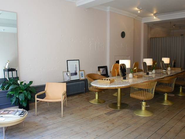


Based on a market research around a focus group of the core salon customers as well as the clients own preferences, the subsequent branding look and feel and stationary were designed to be very luxurious, elegant and minimal, utilising a soft colour palette with tones of white, pale pink, charcoal grey and cream.
It was equally important to stand out as a premium competitor to the other blow-dry salons on the market.

Ideation
We created the brand identity with the ‘R’ designed to subtly look like a strand of hair and chose a semi-sans serif font that we then edited, to keep it timeless, elegant but modern.
The identity has 2 different colours for digital & print: Charcoal grey for printed materials (unless foiled or as a physical sign on the salon frontage) and rose-gold for use digitally.


The brand stationary was kept minimalist and elegant with the logo rose-gold foiled on cream heavy weight card.
Colour Palette & Brand Pattern

A soft colour palette with tones of white, gold, pale pink, charcoal grey and cream.

The brand pattern was specifically created to add a touch of luxury and detailing to corporate branding materials or packaging.
The asset is 2 gold clasps on two individual rods that touch at a single point, and can be used under heading as an accent and as a repeating brand pattern.
Brand Book & Guidelines
Brand guidelines and brand ethos book.


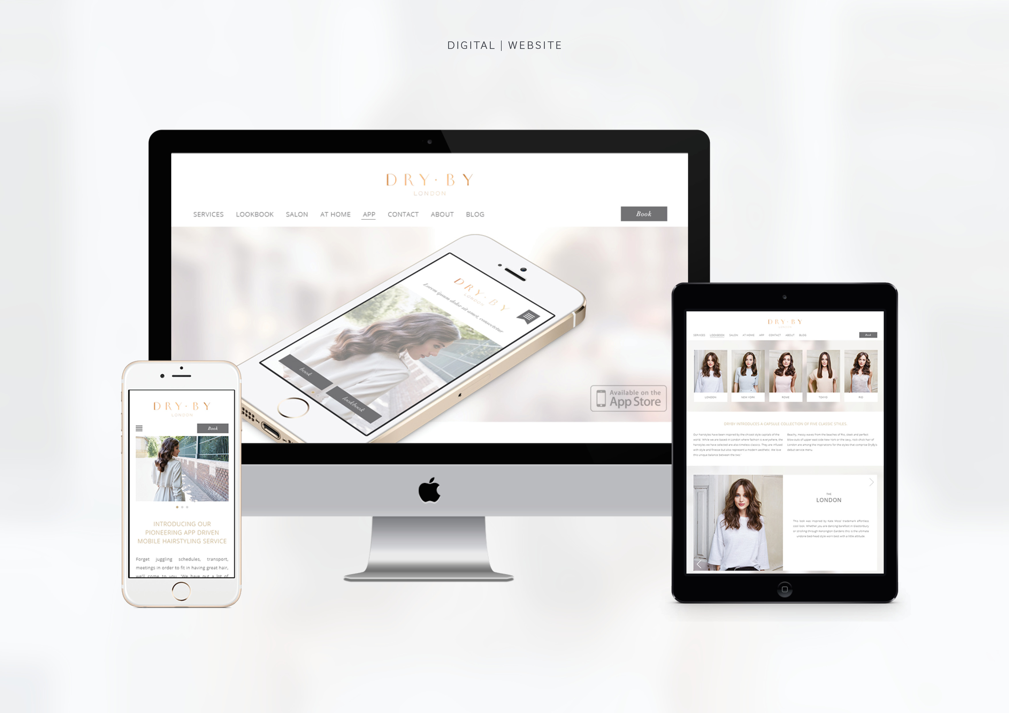
UI/UX Blow-Dry Booking App
The blow dry booking app UI/UX was designed reflected their premium proposition with a unique ability to bring the blow dry to you at home.
Customers can view the blow dry styles offered as well as book a blow dry at home, for a group or at the salon.
The app look and feel reflects the premium brand identity and colours.
Click here for the detailed app case study

UI/UX Website & Blog
The goal for the website was to showcase the 5 salon hair-styles and to encourage users to book or to download the app.

Thank you for making it to the end!
If you have any questions feel free to DM me on instagram or email.
Support my work: Shop for original artwork + limited edition prints
