Itsu is a chain of Asian-inspired food in the UK, with a focus on fresh, fast and healthy food. I was brought in to do their digital design, UI/UX and marketing.
Overview
- UI & UX for Itsu’s in-store self-checkout kiosk. For a detailed case study click here
- Loyalty App Concepts
- Website Home Page Concepts
- Take a Bao Microsite
- Digital Marketing / Advertising: Campaign Microsites, Print, Video, Social
UI/UX for Itsu’s in-store self-checkout kiosk
We designed a self-checkout that included both a cold pick-up and hot order journey combined into a single user journey, keeping in mind at the core Itsu’s ‘served under 90’s seconds’ philosophy. The kiosk is now in a range of stores and will hopefully be rolled out into others.
For a detailed case study on this project click here


For a detailed UI/UX case study on this project click here
UI/UX Itsu’s Loyalty App (Concept)
Context: Based on business insights around what the Itsu customers really wanted from an Itsu app
- Loyalty rewards
- Deals & offers
- Stand out in a market crowded with generic templates
- Exemplify the brand
The core concept behind this loyalty app was owning the Itsu brand colours.
Just as McDonald’s owns red and yellow in the market (now dark green but at its core yellow and red) or Wasabi (lime green), the idea was that Itsu would own yellow and pink as brand colours to set them apart from competitors.
I created the loyalty app concept to use both colour and typography/soft copy to indicate progress.
Each time the user buys a product, the loyalty section would change colour in increments.
Once the user has a free product to claim the entire loyalty section would be a different colour.
The soft copy would help the user know exactly how many points they had left to acquire, as well as being a little human and engaging with them to entertain as well as convey the tone of the Itsu brand (friendly, warm, engaging perhaps a little cheeky).
Each time the user gains a loyalty point the text colour would move up like a liquid and the text would bounce into frame, giving the user a boost of positive the feedback each time to gamify the loyalty section even more.

Website Home Page Concepts
Context: The current Itsu home page has remain unchanged and out of date and hard to update regularly with new products. Layout and imagery do not encourage users to explore the home page, or position the brand as a modern one.
Above the fold, in the centre of the page are buttons navigating the user away as soon as they land on that page. There is also no other reason to engage on this home page.
The menu link can also be reached via the google search page listed quick links as well as in the fixed top bar navigation.
Website analysis & data insights showed us that most users skip the home page to go directly to menu.
This means a key page of digital real estate is currently being wasted
I designed this page concept to encourage the user with these goals in mind:
Team: Itsu Digital Team, Head of Marketing,
Goals
- Engage users to stay on the home page longer
- Showcase the brand campaigns and new products
- Regular and easy updates to the home page
- To still allow users to explore the menu and easily navigate there
- To reflect Itsu’s brand positioning as a modern, contemporary brand that makes fresh, fast and healthy food.
Ideation
Users can still use the button on the header image to navigate straight to the menu
Update the fixed menu at the top to improve its visibility as well as function (highlights, on states and hover states are currently missing. The user has no indication what page they are on)
New products regularly updated to improve google analytics


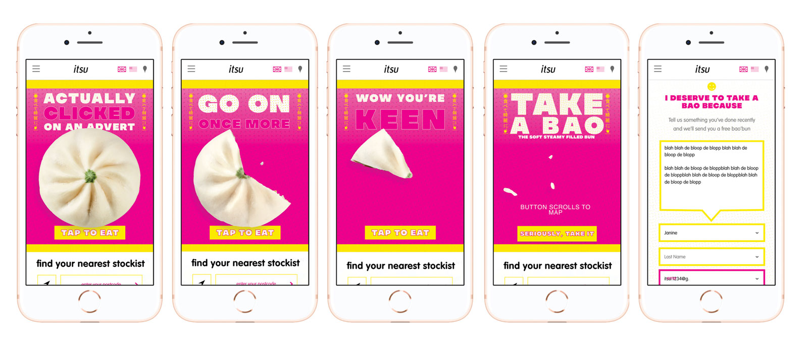
Take a Bao Campaign Microsite & Digital marketing
- Created an interactive campaign microsite for the launch of Itsu’s bao buns.
- User can tap on the bao bun for it to be eaten
- Above the fold would also be visible the store locator in case users wished to skip the interactive element

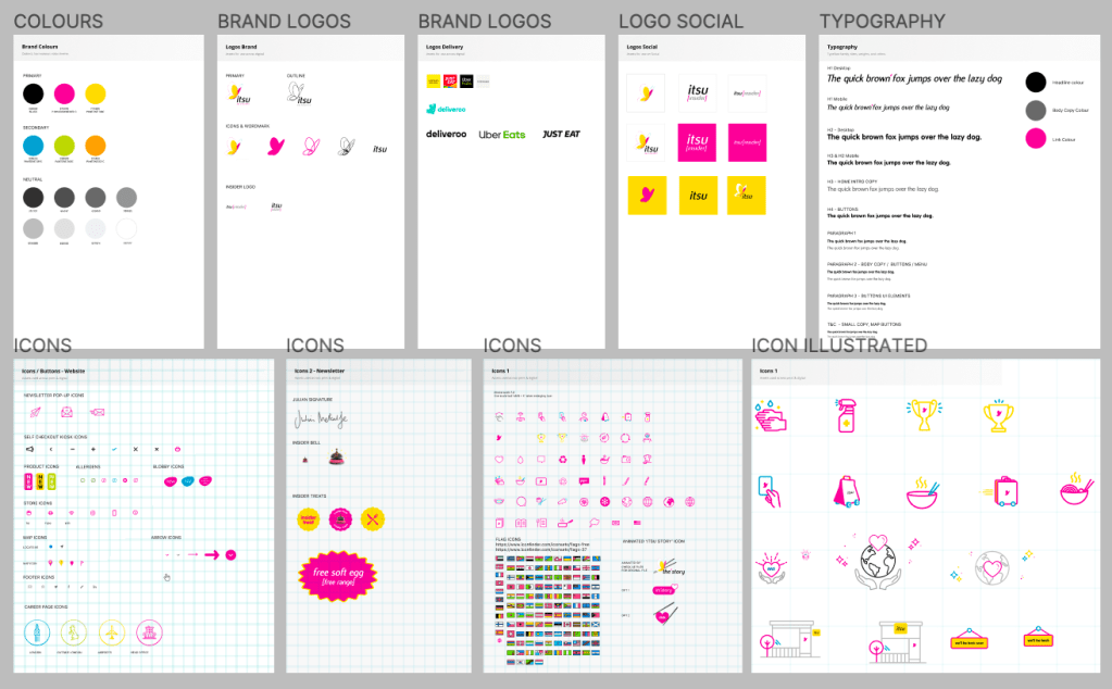
Figma Digital Asset & Component Library
When I joined Itsu all the digital and print assets were scattered across many folders and sub-folders making it hard to find brand assets & icons, and keep them consistent from project to project.
I built and organised a Itsu digital brand library and UI component library in Figma to maintain brand consistency across projects as well as to make it easier for multiple designers across Itsu Grocery & Itsu Retail to collaborate across different digital projects (Kiosk, App, Web, Social, Print)
(Only a selection of the component library shown below)
Creative Campaign Concepts
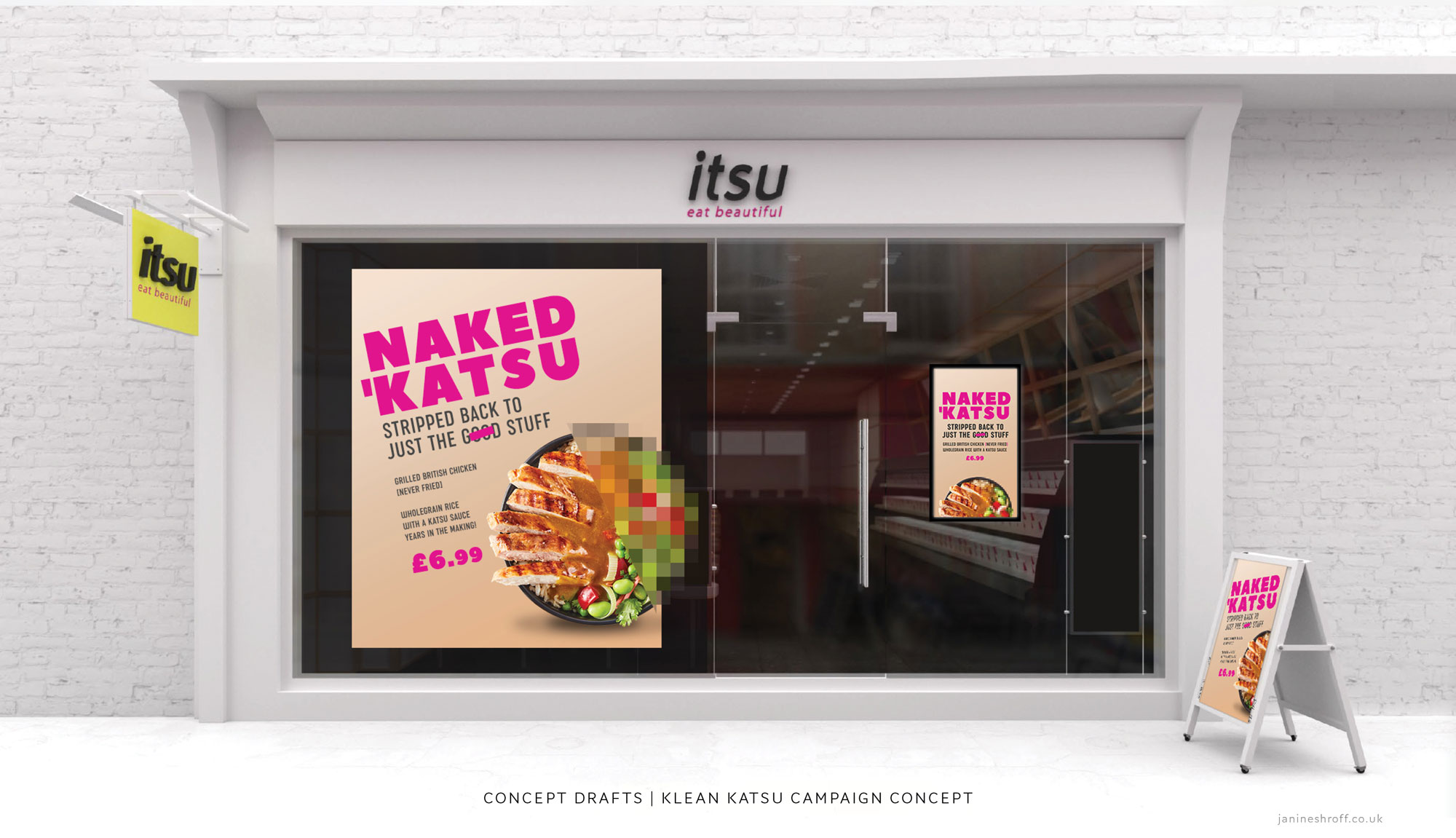
Campaign: ‘Naked Katsu’
Campaign concepts created for a product called ‘Naked Katsu’
Taking the tagline and playing with the idea of censorships by pixellating some of the product and censoring the ‘oo’ in ‘good’

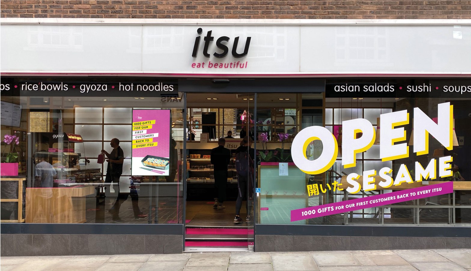
Campaign: Open Sesame
Re-opening campaign (2020) to celebrate the re-opening of stores across the UK after the first lockdown.
Brief: Design a campaign around ‘Open Seasame’ tag line.
Using the Itsu brand style of photography of people in black and white, the concept was the ‘O’ of an open mouth to echo the Campaign tagline of ‘Open Sesame’
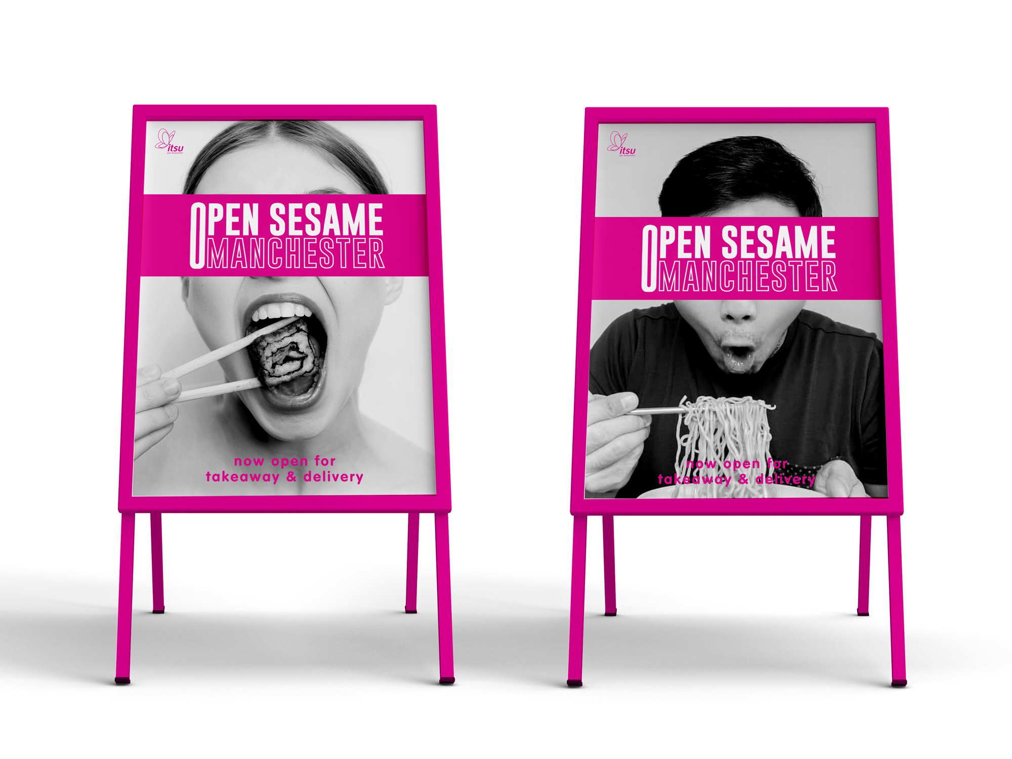
A-board concepts for the Open Sesame re-opening campaign.
Thank you for making it to the end!
If you have any questions feel free to DM me on instagram or email.
Support my work: Shop for original artwork + limited edition prints
